The Psychology of Typography in Design
Separate typographic impressions from reading performance and behavior, then use a seed-exchange announcement to build a fair audience comparison.

Fluency Starts Here
Separate typographic impressions from reading performance and behavior, then use a seed-exchange announcement to build a fair audience comparison.
Learn to identify serifs, compare the other features that shape a font, and test serif and sans serif typography in an original workshop-guide example.
Learn font-menu terms, letter anatomy, hierarchy and spacing by improving an original garden-workshop flyer and checking its finished output.
Choose fonts through project requirements and realistic tests for menus, reports, slides, labels and interfaces, then document a dependable final decision.
Use calligraphic observation to improve everyday letter shapes, joins, spacing and numbers, then test each change in ordinary notes at a useful pace.
Find legitimate free lettering resources and two verified PDFs, then print them correctly and turn tracing into independent letters, words and small projects.
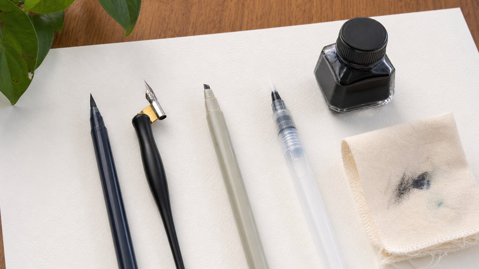
Compare Fudenosuke, Dual Brush Pen and Pilot Parallel by mechanism, scale and first project, with alternative tools and a repeatable pen-and-paper trial.
Construct an original Grow Slowly card with pencil skeletons, readable outlines, balanced spacing and deliberate inking, then use the result to guide practice.
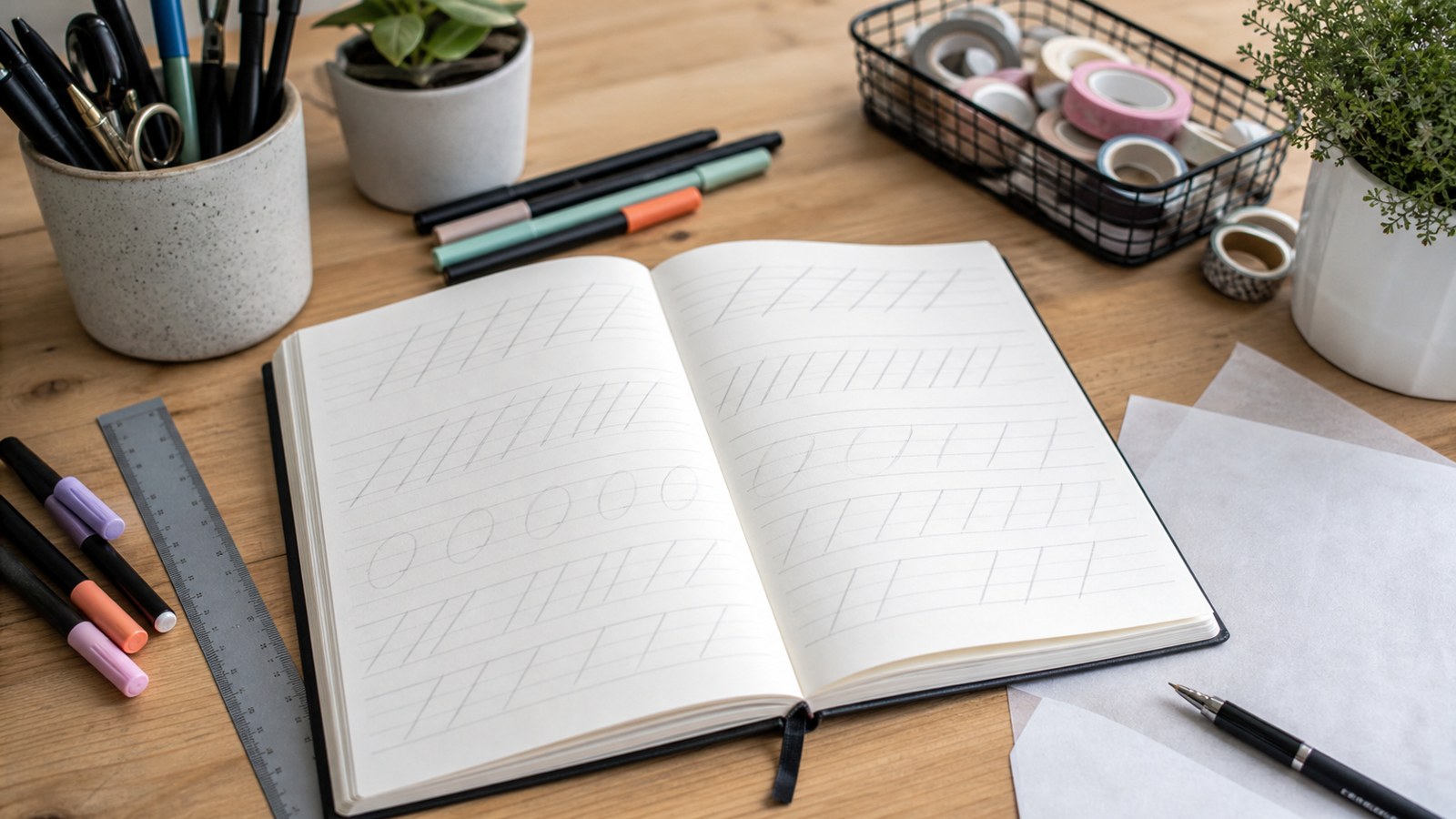
Learn a common Latin brush-calligraphy approach through isolated strokes, turns, ovals and letter construction, then develop luna into a simple name card.