Build a first brush-lettered name from controlled movements
Modern calligraphy can look spontaneous, but a readable brush-lettered word usually rests on deliberate movements. A beginner benefits from learning those movements separately before adding joins, changing the baseline, or extending a flourish. This guide follows a common Latin brush approach and develops an original practice word, luna, before adapting it to a small name card. It does not treat the same pressure rules as instructions for every calligraphic tradition: broad-edge and pointed-pen methods have their own tools and models. You will set up a suitable practice surface, compare light and heavier strokes, form turns and ovals, assemble letters with deliberate pen lifts, and check a complete word. The purpose of the first project is recognizable lettering with more controlled transitions, rather than a flawless alphabet or elaborate decoration. Keep a model for the style you are studying nearby, and use the exercises to understand how its forms are constructed.
A: No. They describe a common Latin brush approach; other scripts and tools have their own methods.
A: Repeated components make it easier to isolate movement and pressure difficulties.
A: No. Deliberate lifts can be part of the letter's construction.
A: Slow down and practice controlled pressure changes in isolated curves.
A: It creates planned variation while retaining a readable word and balanced composition.
A: When the required curves and interior spaces cannot be formed comfortably at that scale.
A: Learn recognizable forms first, then add a limited flourish with sufficient space.
A: Its connections or spacing may conceal distinctions that were visible in isolated forms.
A: Yes. Inspect the tool and surface as well as your movement.
A: A more controlled stroke or clearer connection is useful progress without requiring a finished artwork.
Prepare a tool and model that belong to the same method
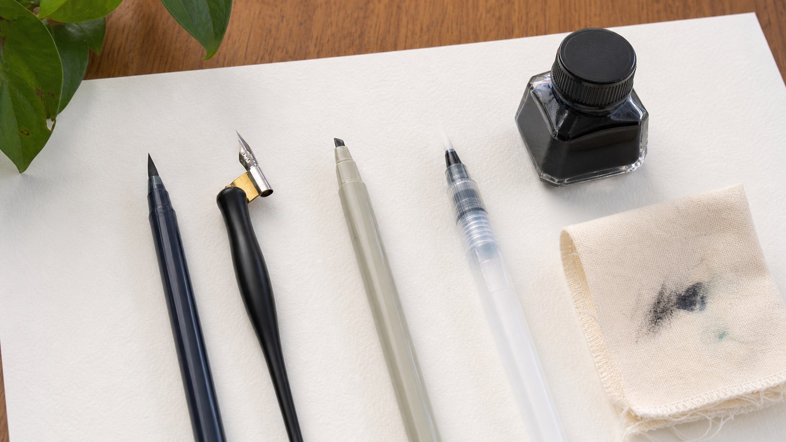
Choose a flexible brush pen that can comfortably make the model’s letter size. A compact tip and a large brush tip require different amounts of room. Compare the scale before beginning rather than forcing a large tip through tiny counters. A pencil can help you understand the forms, but it will not reproduce the brush’s pressure response. That difference is useful when separating construction problems from tool-handling problems.
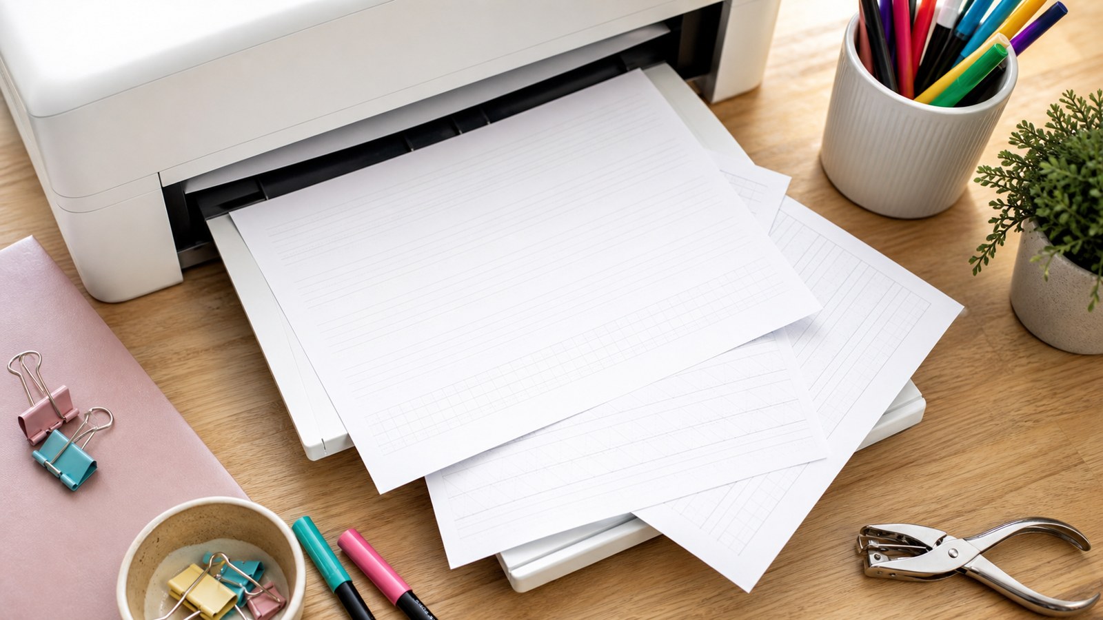
Use a smooth surface suitable for the pen and leave a spare area for testing its marks. Tombow’s Fudenosuke worksheet description provides one identifiable beginner resource and accompanying paper guidance. Select a model that shows the method you intend to learn, not merely a photograph of attractive finished words. A model’s movement instructions and pen lifts can explain details that an outline alone leaves uncertain.
Set a writing zone you can see and use comfortably
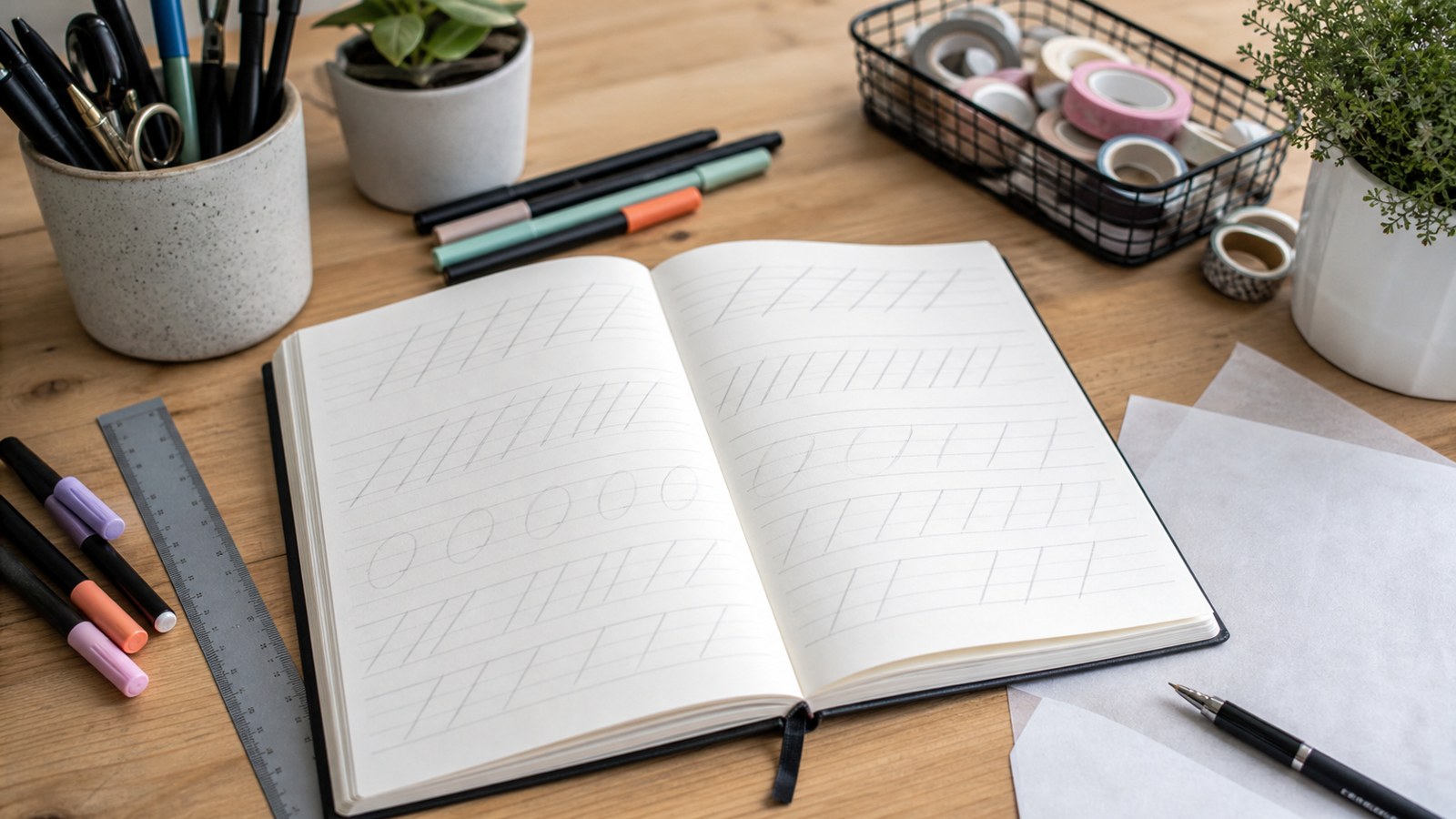
Mark a baseline and a light guide for the main lowercase body. Leave space above for ascending forms and below for descending forms. Those zones give you references for height without requiring every letter to fit into one identical box. A tall loop and a small oval have different structural roles. Clear guides make accidental changes in those relationships easier to notice.
Position the page so you can see the movement and travel across the row comfortably. Adjust the angle to your hand rather than copying a demonstrator’s posture rigidly. Keep the grip workable and pause when fatigue or discomfort changes your control. The exercise should let you observe the tip’s response without compensating through increasing force. A short deliberate row is more informative than a page completed after attention has faded.
Test the pen on the spare area before the guided row. Inspect whether the mark is consistent and whether the surface produces unexpected spreading. A dry or damaged tip can complicate practice, so check the tool as well as your movement. Once the setup behaves predictably, keep it stable for the comparison. Changing paper, scale, and pen simultaneously makes it difficult to tell why the next row looks different.
Separate a light rising stroke from a controlled falling stroke
Make several light upward movements, then several downward movements with controlled added pressure. In this common brush approach, the contrast helps establish the style’s stroke rhythm. Use enough pressure to create the intended heavier mark without treating maximum force as the goal. Compare repeated strokes for continuity, not just the largest possible difference in width. If the heavy mark suddenly balloons or the light mark catches, slow the movement and inspect the tip’s path. The two isolated rows let you identify which direction needs attention before a curve asks you to change pressure during the same movement.
Practice turns where the pressure changes direction
An underturn moves through a heavier descending part into a lighter rising part. An overturn begins with a lighter rise and turns toward a heavier descent. Follow the chosen model’s construction, easing or adding pressure through the transition rather than switching abruptly at one corner. Repeat a few turns at a generous scale, then compare the smoothness of their changing width.
A compound curve combines related turns in one form. Its purpose in the exercise is to maintain recognizable shape while managing more than one transition. If it becomes lumpy, separate the component turns and identify where the change becomes sudden. Do not keep repeating the full shape without observing that point. A smaller diagnosis gives the next attempt a specific purpose and prevents an entire practice row from becoming an unexamined habit.
Give ovals and loops enough room to remain open
Follow the model’s starting point for an oval, noticing how its heavier and lighter portions meet. Keep the interior space visible rather than judging only the outside edge. A very small oval may close because the tool is too large for the scale. Enlarge the form and compare another attempt before pressing harder or speeding up. The correction should address the actual mismatch.
An ascending loop extends into the upper zone, while a descending loop uses the space below the main body. Compare their relationship to the lowercase height. Loops should remain distinguishable from neighboring forms and should not tangle with another line. A decorative extension that looks graceful in isolation can become confusing beside an ordinary letter. Keep the initial loops simple enough to read within a word.
Use isolated attempts to compare one detail at a time: the oval’s opening, the loop’s height, or a sudden change in thickness. Then return to the complete form. You do not need to make every attempt identical, but you should be able to identify which one better reflects the model and why. That observation prepares you to build letters from the components rather than merely copy a finished silhouette.
Assemble familiar letters with deliberate pen lifts
Study how the model builds a u from an underturn-related movement and an n from an overturn-related movement. Practice the component first, then add the remaining stroke as demonstrated. Lift the pen where the construction calls for it; a lift is not a failure of fluidity. It gives you an opportunity to reset position and preserve the letter’s shape. Compare u and n beside each other to check that their direction and structure remain distinct. When one becomes ambiguous, revisit its component rather than adding a flourish to disguise the uncertainty.
Construct luna before decorating a complete alphabet
For the original practice word luna, inspect the model’s l, u, n, and a individually. The l introduces an ascending form, u and n connect familiar turns, and a requires a recognizable oval-related construction. Write them separately at a common lowercase height before arranging the word. This keeps a difficult letter from disappearing inside a rushed connection.
Combine the forms slowly, retaining pen lifts where the model uses them. Give the exit of one letter enough room to meet the next without hiding its important opening. Inspect the repeated body height and the spaces around the taller l. A joined word may require different apparent gaps from a row of separated letters. Judge luna as a complete word rather than preserving every isolated letter exactly where you first placed it.
Write an undecorated version on a fresh baseline. Ask someone unfamiliar with the model to read it without supplying the word first. If the a resembles an o or the n becomes lost in a connection, simplify that part and test again. Recognition is a useful early checkpoint. A word that needs explanation is not ready for extra baseline variation merely because its thick-and-thin contrast looks attractive.
Troubleshoot the mark rather than restarting everything
An abrupt heavy spot suggests examining the pressure transition and movement at that point. A filled counter suggests examining scale and width. A crowded connection suggests separating the letters and rebuilding the join. A shaky curve may benefit from slower isolated practice, but also inspect whether the tip and surface are behaving consistently. These observations are practical troubleshooting questions, not guarantees that one adjustment fixes every learner’s difficulty.
Keep a short comparison row with the original problem and a revised attempt. If the counter opens after enlarging the form, record the useful scale. If the join improves after a pen lift, retain the lift instead of treating uninterrupted writing as a higher achievement. Stop when attention or comfort no longer supports deliberate practice. The next session can resume from a clear observation rather than from a general feeling that the whole alphabet went wrong.
Introduce variation only after the word reads clearly
Modern brush lettering can include deliberate changes in baseline, proportion, or an exit stroke. Begin with one small change and compare it with the readable undecorated version. A planned bounce should not make the n look like another letter or place the a where the reader loses the word’s sequence. A flourish needs enough empty space to remain separate from important forms. Variation is a composition decision, not a requirement to make every letter depart from the guides. A quieter word with consistent structure can be a complete successful result.
Adapt the practice to a small finished name card
For a fictional name card reading Luna, study the capital L in your chosen model before replacing the lowercase practice form. Sketch the arrangement lightly and check the full name at the card’s actual size. Leave comfortable margins rather than stretching the last stroke to fill every gap. Keep a spare sample of the same stock for testing the pen before working on the final card.
Let wet marks dry before moving your hand across them or erasing any pencil guides. Follow the medium’s instructions and test erasing on the spare sample first. Then inspect the name’s reading order, openings, and spacing from an ordinary viewing distance. The finished card introduces constraints that a roomy worksheet does not. Those constraints make it a useful transfer project, even when the lettering remains simple.
Plan the next session around an observed improvement
Save the stroke row, undecorated luna, and finished card. Note a particular change: the underturn became smoother, the a stayed open, or the connection after n became clearer. Use that observation to choose the next exercise. If one transition remains awkward, practice it in another familiar letter before collecting a new alphabet model. A focused sequence gives the practice continuity without demanding an elaborate schedule.
Once the basic construction remains understandable, try another short word that introduces a different letter while preserving the movements you know. Keep its scale and model consistent for the first attempt. This reveals whether a familiar component transfers, rather than whether you can reproduce the same memorized word indefinitely. Treat the new letter as another construction to examine, not a reason to discard everything that has improved.
A first modern brush project is complete when its forms are recognizable and its important movements are becoming more deliberate. Begin with an appropriate tool and visible guides, isolate the transitions, assemble letters through the model’s method, and test them inside a meaningful word. Decoration can follow where it helps the composition. The dependable foundation is a clearer understanding of how each mark works and how neighboring marks become readable lettering together.