Draw a small message before trying to master an entire alphabet
Hand lettering begins with a useful freedom: you can revise the letters before they become final. You can sketch their structure, move a word, widen a counter, erase an awkward join, and build the composition in stages. That makes a pencil an excellent starting tool, even when the finished work will use ink. This guide develops an original two-word card, Grow Slowly, from a rough arrangement to a readable finished design. Along the way, you will learn the distinction between drawn lettering and calligraphic writing, how simple letter skeletons become outlines, and why spacing deserves attention before decoration. The process is intended for a beginner making a modest card or label, not a promise that one project covers every lettering tradition. A manageable message gives you room to observe the whole composition while learning its parts. Finishing that message teaches more than collecting styles you have not yet tried to construct.
A: Yes. A pencil is well suited to constructing and revising drawn forms.
A: No. You can sketch, build, refine, and finish letters in stages.
A: The skeleton suggests the central structure; the outline defines the letter's final edges.
A: They let you compare arrangements before investing in detailed drawing.
A: Use a deliberate change in scale, weight, placement, or style that preserves readability.
A: No. Different neighboring shapes produce different-looking gaps.
A: Remove it when it obscures a letter, confuses the order, or competes with the phrase.
A: A short message on a small surface with a clear reader and purpose.
A: It reveals bleeding, drying behavior, and stroke width before the final drawing.
A: It records construction and layout decisions that can be improved in the next attempt.
Understand the work you are drawing
Hand lettering constructs letters for a particular composition. Calligraphy commonly forms them through a writing method, while typography arranges existing type. Speedball’s calligraphy and illustration introduction makes the useful writing-versus-drawing distinction. In practice, artists can combine methods, but a beginner does not need to complete a drawn design in one uninterrupted stroke. You can develop a capital G through several pencil passes and refine its edges later. The important question is whether the final form reads clearly and belongs with its neighbors. A rough construction is part of the work, not evidence that you have failed to write beautifully on the first attempt.
Give the card a purpose and a limited set of tools
For the original Grow Slowly card, imagine a quiet encouragement sent with a small plant. The words should be easy to read, with a more prominent Grow and a supporting Slowly. This purpose provides a reason for the hierarchy without assigning a fixed emotional meaning to any font category. Decide how the recipient will first see the card and how much writing space its size leaves.
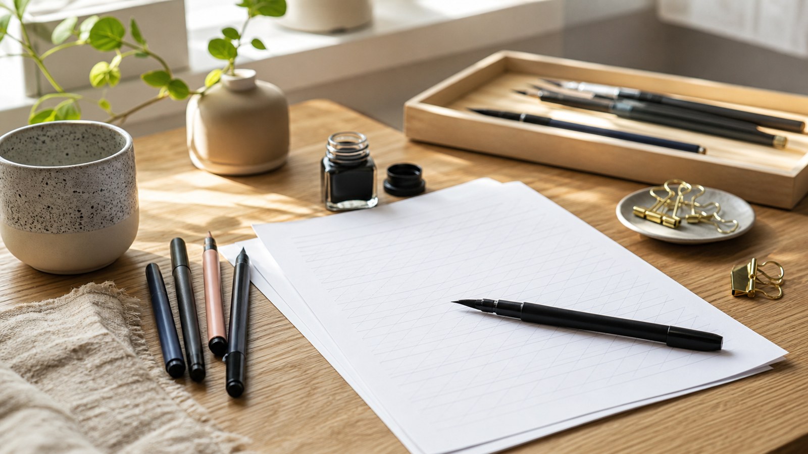
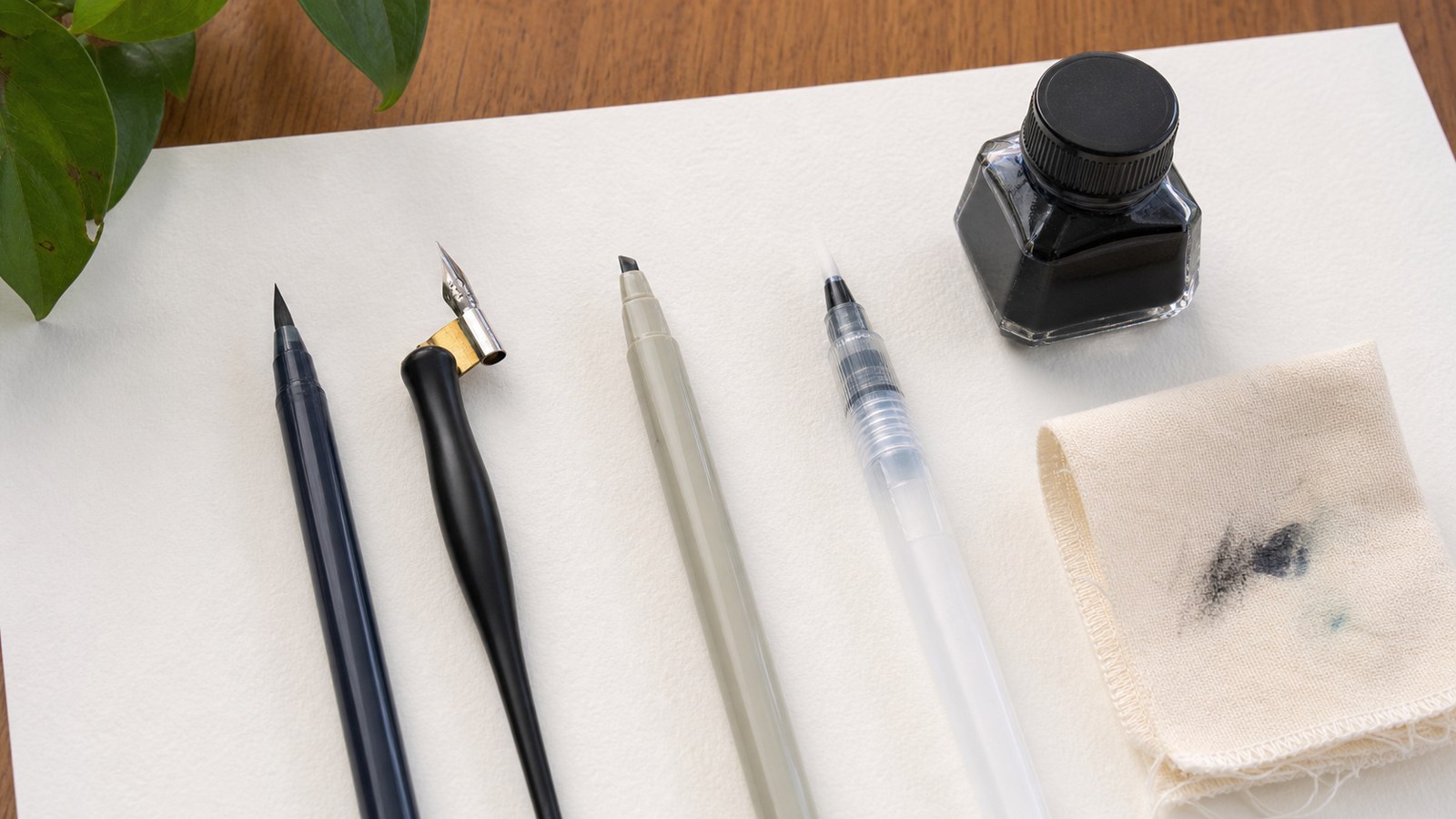
Use a pencil, eraser, ruler, paper, and a suitable finishing pen if you intend to ink it. Fancy markers are optional. A pencil lets you compare proportions and placement before committing to a stroke width. Test the finishing medium on spare paper, including whether it spreads, dries slowly, or lifts during erasing. The final surface should support the method rather than surprise you after the main letters are complete.
Keep an extra sheet for small arrangement sketches. It separates exploratory decisions from the cleaner drawing and reduces the temptation to preserve the first layout merely because you have already invested time in it. Start with an ordinary monoline or simple block construction. Complex shadows and intertwined script can wait until you can identify what the undecorated words need.
Choose the reading order with tiny layout sketches
Make three small sketches without drawing polished letters. In one, put Grow above Slowly; in another, keep both on a line; in a third, make the first word large with the second tucked beneath it. Use simple word-shaped blocks to judge the overall silhouette. The sketches need only show approximate width, height, and position. Their purpose is to compare arrangements quickly, before individual letters distract you.
Choose the version whose line break preserves the phrase’s meaning and fits the card comfortably. A stacked arrangement may let Grow occupy more space while Slowly remains a clear second line. Leave visible margins and enough room between the words. If the narrower line seems awkward, adjust its scale or alignment rather than adding decorative marks solely to fill every empty area. Space is part of the composition’s structure.
Establish a light structure for the selected arrangement
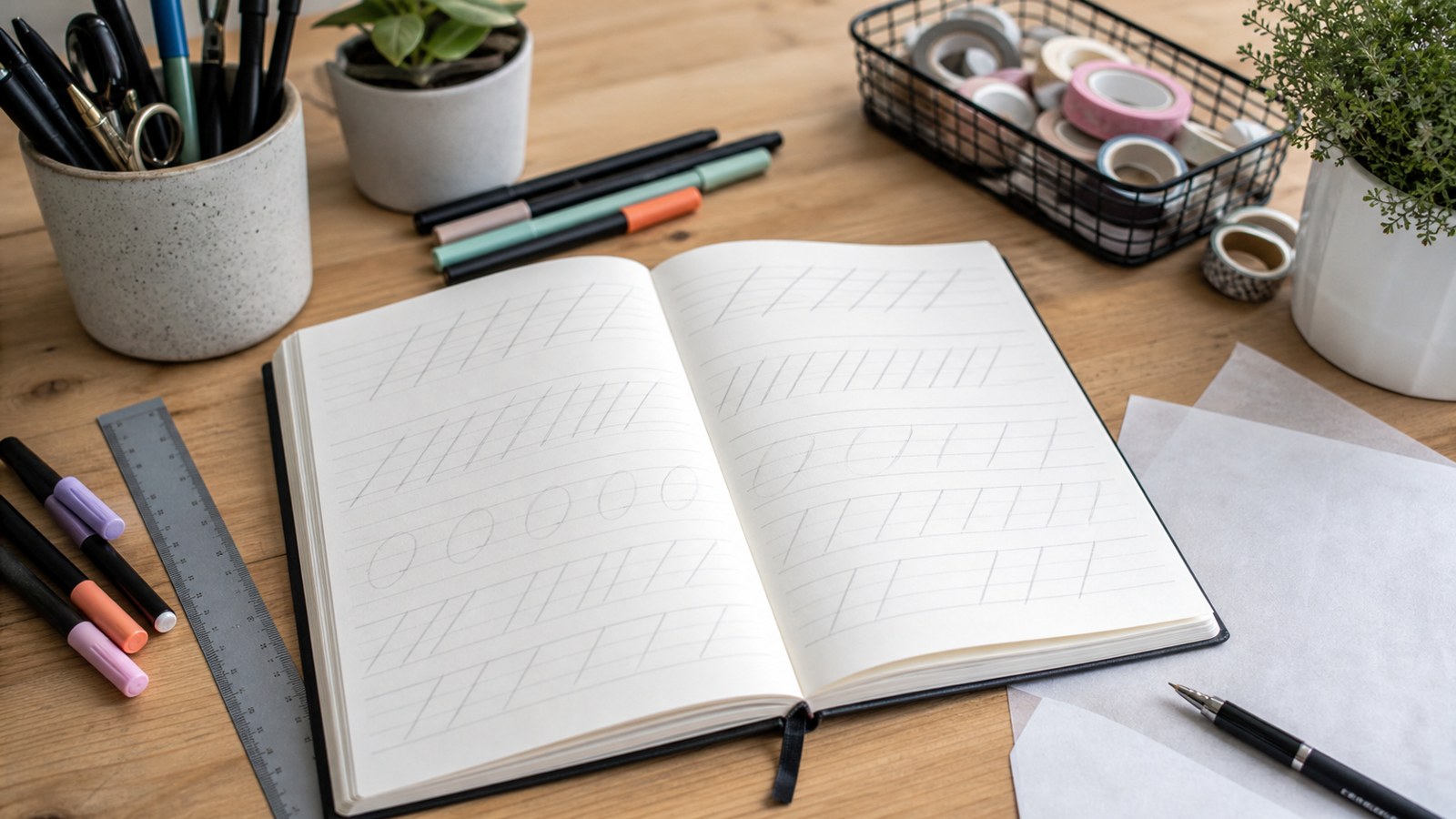
Draw faint guides for the top and bottom of the main word and a baseline for the supporting word. Mark the intended center or starting edge, depending on the chosen alignment. Then sketch each letter as a simple skeleton: a centerline suggesting its basic shape rather than a complete outline. In GROW, the rounded G and O, the straight and diagonal parts of R, and the wide W create different spacing demands. Let the skeleton reveal those demands before adding thickness. If the word runs out of room, revise its placement now instead of compressing the final W into the remaining gap.
Build a coherent set of letters from their skeletons
Add stroke width around the selected structure, keeping a common visual weight. For a simple block treatment, the upright stems should look related, and rounded forms should preserve open interiors. The R needs a recognizable bowl and leg; the G needs an opening that keeps it distinct from the O. Inspect the whole word after each substantial change. A letter may look elegant alone while becoming too heavy beside its neighbors.
Use the supporting word to establish another deliberate role rather than an unrelated style experiment. Slowly could use smaller monoline letters with a comparable sense of openness. Keep repeated lowercase bodies consistent enough to belong together, while allowing the taller l and descending y their appropriate space. The two words do not need identical forms, but their alignment, weight relationship, and spacing should explain why they share the card.
Treat interior spaces as shapes you are designing
The empty area inside an O or R is a counter, and its shape contributes to recognition. When you add thickness, that area becomes smaller. Compare it with the neighboring letters’ open spaces rather than judging only the outside contour. If the O becomes a dark ring with a tiny interior, it may feel heavier than the G even when their outlines have similar dimensions. Revise the inner and outer boundaries together.
Examine smaller forms in Slowly at the size they will appear. An attractive loop can fill or become ambiguous after inking, especially if the medium spreads. A drawn script does not need to connect every pair tightly. You can simplify a join or leave a deliberate separation where it improves reading. Keep the identity of the letter ahead of the decorative movement.
A useful check is to set the pencil down and read the phrase as someone receiving the card would. If you must remember which letter a complicated shape represents, the drawing still needs clarification. Enlarge a cramped counter, restore an opening, or remove a crossing stroke that conceals the form. These repairs strengthen the message without requiring a new layout or a different alphabet.
Use repeated forms to check the developing style
On spare paper, draw ROOM in the same simple block direction. Its two O forms let you compare height, width, stroke weight, and interior space without changing the underlying letter. If they seem to belong to different alphabets, identify which proportion differs and revise that feature.
Return to the O in GROW with that observation in mind. Repeated practice should clarify the construction rather than force every curve into a rigid geometric shape. A small optical adjustment can help a rounded letter belong beside straighter neighbors, provided its weight and opening remain coherent with the word.
Balance the spaces between letters by eye
Equal measured gaps do not necessarily look equal. A rounded O beside a diagonal W creates a different pocket of space from two upright stems, and the broad W affects the word’s balance. Compare those empty shapes in GROW, move a letter where needed, and reread the complete word before changing another pair. The goal is a coherent rhythm, not mathematically identical strips of white space. Leave a visibly different gap between the two words if they share a line, or a clear line separation if the arrangement is stacked. Good spacing helps distinct letters become one understandable word.
Add emphasis without making every feature compete
The larger Grow already establishes a first reading point. Keep Slowly secondary through scale and weight rather than making it harder to recognize. If both words become highly decorated, the intended hierarchy can disappear. A recipient should not need to solve the ornament before discovering the phrase. Compare an undecorated version with any embellished version and ask which one communicates more directly.
A small leaf detail may suit the card’s purpose, but place it where it does not resemble another letter or split a word. A flourish should occupy available space without crossing important openings. Try the detail lightly in pencil before committing it to ink. If removing it improves the reading order, remove it. A finished lettering piece does not require decoration in every corner to demonstrate that care went into it.
Ink the drawing with the final surface in mind
Test the pen’s actual line on the same stock, then work through the main forms in a sequence that lets wet marks dry before your hand passes over them. Follow the medium’s instructions rather than assuming every ink behaves alike. A left-handed writer may prefer another working direction or page position. Keep the surface visible and avoid turning the inking stage into a race to preserve the appearance of fluent handwriting.
Refine an uneven edge in small increments. Repeatedly widening an entire letter to fix one corner can make it darker and less consistent than its neighbors. Compare the correction with the pencil plan and the adjacent forms. If a mistake is substantial, a fresh sheet may be more useful than layering extra decoration over it. The initial sketch remains valuable even when the final medium requires another attempt.
Erase guides only after the marks have dried sufficiently and a spare-paper test shows that the medium tolerates erasing. Inspect counters, punctuation if any, and the spaces around the phrase. Check spelling before presenting the card. An extra flourish is optional; correctly formed words and a clean arrangement are the essential finished result. Photographing the card straight on can reveal a tilted line or an imbalance that was less obvious while you worked close to it.
Use an awkward result to choose the next exercise
If GROW feels uneven, identify whether the problem is weight, proportion, or spacing. A heavy O calls for a counter and stroke-width comparison; an isolated-looking W may need another gap; a cramped R may need a clearer leg. Make a small revised sketch of that feature instead of redrawing the entire card without a plan. The correction should answer something you observed in the finished composition.
If the phrase reads clearly but the overall arrangement feels too crowded, revisit the margins and line separation. You may need smaller words or a more suitable card size, not a more sophisticated lettering style. Save the original arrangement beside the revision so you can see what changed. That comparison builds judgment about space and hierarchy, skills that transfer to a different phrase even when its letters have different shapes.
Finish one message and carry one lesson into the next
Keep the rough layouts, chosen pencil construction, and finished card together. Record one useful observation, such as preserving the opening in G or leaving enough space beside W. For the next small project, apply that principle to new words rather than copying the entire card. Hand lettering grows through repeated construction and revision: decide the message, sketch the arrangement, build recognizable forms, balance their spaces, and finish deliberately. The first piece does not need to establish a personal signature style. It needs to show that you can make an understandable message and explain the choices that helped it work.