Start with a usable download and a clear practice goal
Free lettering sheets are useful when they teach something you can carry into your own words. A page full of tracing can look satisfying without helping you construct a new letter, control a brush transition, or arrange a phrase independently. Begin with a legitimate creator’s download, choose a sheet suited to your tool, and decide which skill you want to practice. The resources below include verified public PDFs from Tombow and additional official worksheet collections. They cover different approaches, so you do not need to print them all or buy every pen named in their descriptions. This guide explains where to begin, how to follow each resource’s printing instructions, and how to move from tracing to independent work. It also makes the distinction between a free personal-use worksheet and permission to redistribute someone else’s design. A useful practice session produces a clearer form or connection, not merely a completed stack of pages.
A: Tombow's official collection at https://www.tombowusa.com/collections/lettering-worksheets-printables offers identifiable practice resources.
A: No. Read the resource's stated permission rather than assuming you can repackage it.
A: A fit-to-page setting can alter its scale; inspect the PDF and printer settings.
A: Rough surfaces can wear flexible tips, so use paper appropriate for the pen.
A: Compare its suggested tool and lettering size with your pen's capabilities.
A: Try a few independent letters and then an unfamiliar word.
A: No. They guide practice and should not become visible finished strokes.
A: Sometimes, but pressure-based models may require adaptation or a monoline-specific sheet.
A: It lets you catch scale, clipping, and visibility problems without wasting pages.
A: When you can reproduce the useful forms and spacing in independent words.
Download a beginner brush sheet from its original provider
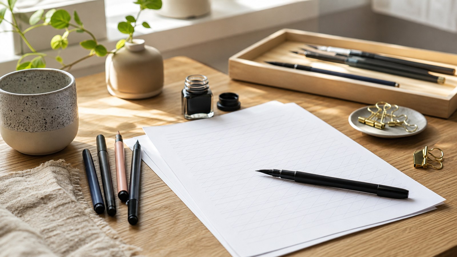
Dawn Nicole’s four-page Fudenosuke beginner PDF is available through Tombow’s official site. The accompanying resource description identifies stroke practice, lowercase script letters, and words. It is a sensible starting point when you want a small brush-lettering model. Read the file’s personal-use notice before copying or sharing it.
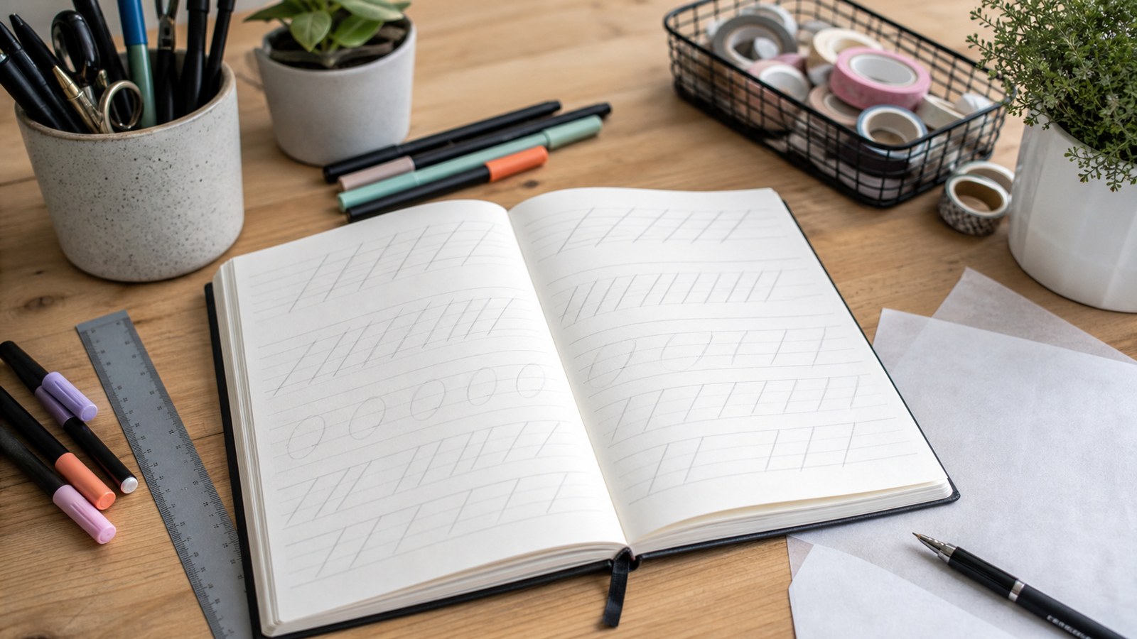
Use the stroke work to examine one transition before attempting the full alphabet. A row of similar marks makes a sudden heavy spot or uneven curve easier to notice. Pick one feature to compare, then write a short independent row on spare paper. This second row is the beginning of a transfer test: you are checking whether the movement can be repeated without the printed shape beneath it.
Use a word sheet when individual letters already feel familiar
Tombow also provides a Fudenosuke Days practice PDF. Its printing note specifies fitting the PDF to the page and recommends a smooth printing surface or a suitable tracing or marker-paper overlay. Follow that file’s instructions rather than applying an automatic actual-size rule to every download. A word-oriented exercise is useful for examining transitions and spacing after isolated forms become manageable. Do not rush through an entire themed set simply because the words are familiar. Choose a difficult connection, practice it separately, and try it inside another word absent from the sheet.
Choose faux calligraphy when your pen has a fixed-width tip
The MONO Drawing Pen faux-calligraphy resource offers another route. Tombow describes a downloadable set with instructions, an alphabet model, and uppercase and lowercase tracing practice. Faux calligraphy builds the appearance of thicker strokes by drawing additional width rather than generating it through brush pressure. That distinction makes it relevant when you are working with a suitable ordinary drawing pen instead of a flexible tip.
Try an original exercise with the word calm. Draw a simple monoline version, identify the strokes that would be heavier in the model, and add width consistently beside those strokes. Preserve the enclosed spaces as you refine the edges. If thickening a stroke closes the a, enlarge the construction or reduce the added width. A filled outline should still communicate the letter clearly.
Check the resource page for its current download and instructions. If a provider changes its website, return to the official worksheet collection rather than downloading an uncredited copy from an image search. The named resources are starting options, not a claim that every item in the collection teaches the same method. Match the description to the practice you intend to do.
Follow a lesson sequence when you need more than a model
Tombow Europe’s Fudenosuke lettering lessons pairs introductory instruction with free templates and progresses through letters and later decorative topics. The early lessons are more useful for a new learner than jumping directly to flourishes or shadows. A demonstration can clarify where a movement begins and when the pen lifts, information that a finished outline may not show.
Watch one movement, pause, and attempt it beside the guide. Then compare a particular feature rather than trying to recreate the demonstrator’s entire style immediately. If a video uses a tool different from yours, consider what changes in scale or pressure response before judging your result. A guided sequence can provide structure, but the independent attempt is still necessary if you want to use the forms in an original card or label.
Read the sheet's guides before filling the first row
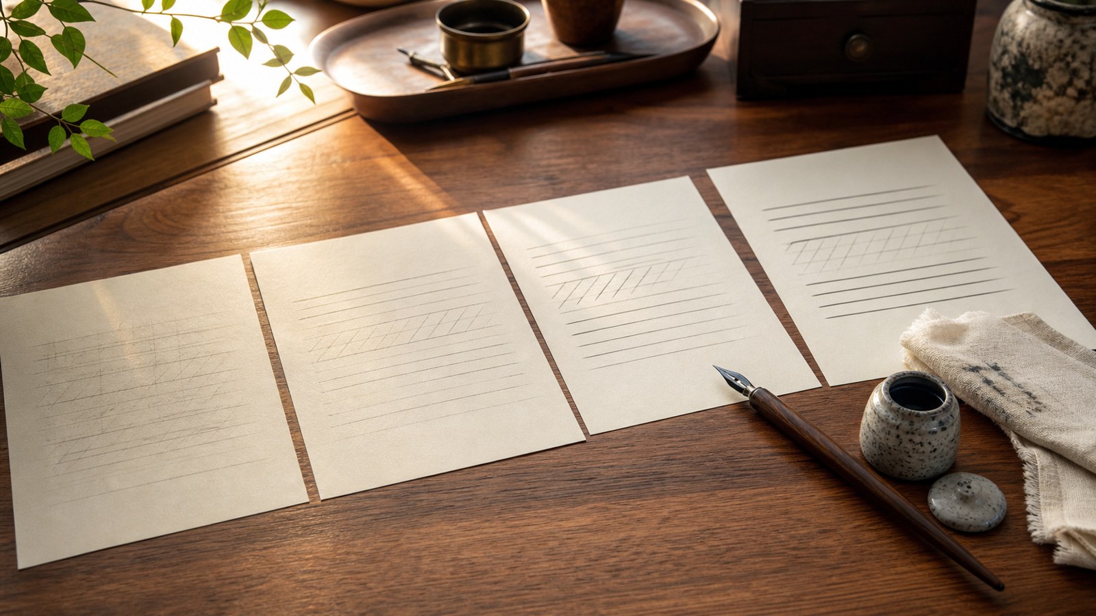
Locate the baseline, the main lowercase zone, and the spaces reserved for ascending and descending forms. Diagonal guides may indicate a suggested slant, while arrows may describe movement where the creator supplies them. Do not invent a stroke order from an unfamiliar diagram. Compare the model’s thick and thin areas, then distinguish shape from spacing: a letter can match its outline while sitting too close to its neighbor. The guides support practice; they are not additional strokes that belong in the finished lettering. Keeping those functions separate prevents a worksheet from becoming a picture you copy without understanding its construction.
Print one trial page before making a practice stack
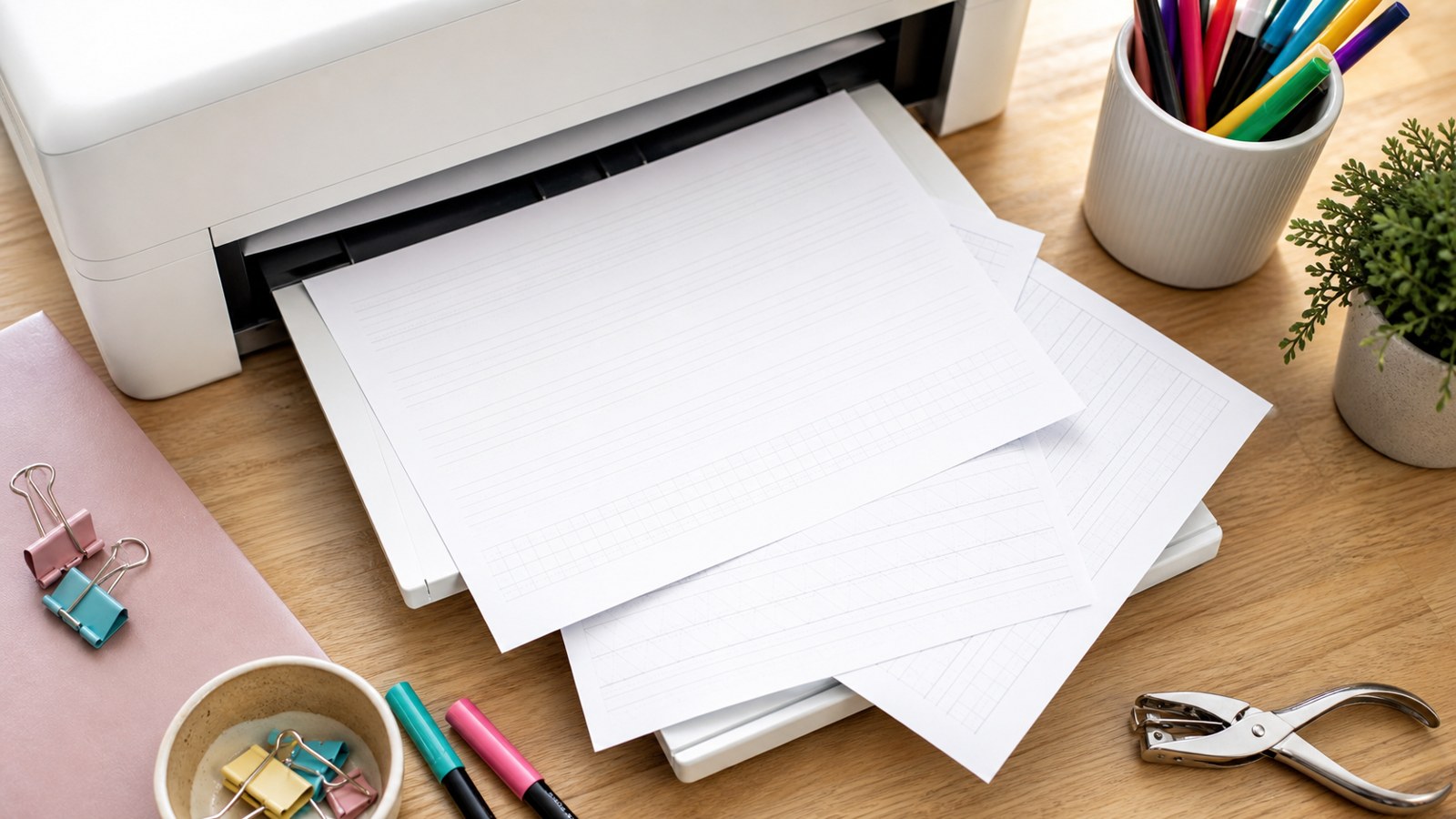
Inspect the PDF’s intended page dimensions and its own print note. Actual-size printing can preserve a designed scale, while a file may explicitly call for fitting to the page, as the Days resource does. A general preference should not override the creator’s instruction without a reason. Preview the margins and print one page to see whether guides, examples, or instructions are clipped. Record the setting that produces the intended usable sheet.
Compare the printed forms with your pen’s comfortable range. A large brush tip can fill a tiny model’s interior spaces even when your movement is deliberate. Shrinking the same PDF further will not solve that mismatch. Choose a sheet at a more suitable scale or a smaller tool you already own. Similarly, enlarging a small script model changes the movement required; it may become a different exercise rather than an easier version of the original.
Protect flexible tips with an appropriate surface. Use the provider’s paper guidance and test unfamiliar stock on a spare area before a long session. A smooth overlay can let the same guide support repeated attempts, provided the guide remains easy to see. Keep the overlay stable enough to follow the line without pressing excessively. The useful setup is one that lets you observe the movement, not one that makes you struggle to see a faint model underneath.
Turn one traced letter into a word you chose yourself
Trace a model once or twice while noticing its beginning, direction changes, and finishing point. Write the same letter beside it without tracing, then cover the model for another attempt. Compare one feature, such as the width of an oval or the height of an upright stem. Covering the guide is a modest recall exercise, not a test you have to pass before continuing. Return to the model when the construction becomes unclear.
Place the letter inside an unfamiliar word. If you practiced an a, try calm or harbor rather than only the sheet’s example. Inspect the a and its neighbors together: a clear isolated form may lose its opening inside a crowded connection. Separate that pair, practice the join, and return to the complete word. This process reveals a specific problem to work on instead of treating the whole page as an undifferentiated success or failure.
Use a simple session to connect three kinds of practice
An original session could begin with a short curve row, continue with three independent a forms, and finish with the word calm. Each stage asks a different question: can you control the movement, recognize the letter’s structure, and place it among other forms? Leave space beside the worksheet for these attempts. A page with no blank working area can encourage continuous tracing even when a different task would reveal more about your progress.
Respect the difference between access and redistribution
A free download means the provider has offered access under stated conditions. It does not automatically authorize repackaging the file, removing attribution, selling copies, or uploading it to another website. Dawn Nicole’s linked PDF expressly identifies personal use. Keep that notice intact and follow it. If you want to distribute a sheet in a class or a commercial workshop, look for permission covering that use or ask the rights holder before making assumptions.
Share the original resource link when you want someone else to find the worksheet. That lets the creator supply the current file and accompanying instructions. Keep your own practice work separate from the supplied model, especially when posting results online. Explain whose guide you used where appropriate, and do not present its alphabet as a design you created. An accessible resource can support your learning without making its creative work yours to redistribute.
Plan two sessions around one original word
Choose orchard as an original target and write it once before beginning a worksheet. In the first session, use a relevant guide to study the oval in o and the transition into r, then produce several independent versions of that pair while leaving the rest of the word uncomplicated. In the second session, return to the whole word on a blank baseline, compare the interior spaces in o and a, and check whether the final d leaves enough room for the word to finish comfortably. If the first pair has improved but the final letters now crowd together, keep the improved pair and revise the arrangement instead of restarting every letter from a new model. Save both dated attempts beside the original so the next practice question comes from something you can see: a clearer opening, a cramped connection, or a word gap that needs more distinction. This small plan gives the worksheet a role in your own work and keeps a completed tracing row from becoming the only measure of progress.
Know when another sheet is no longer the next step
Move beyond a model when you can reproduce its useful features in a short independent word. You do not need a flawless alphabet before trying a small finished project. A gift tag with one name or a card with a two-word greeting offers a manageable transfer task. Sketch its arrangement lightly, then use the lettering method you practiced. The new surface and spacing will show which habits are stable and which still need a guide.
If the result becomes unclear, identify the point of difficulty before collecting more downloads. It might be one connection, a large change in scale, or an arrangement that forces the final word into too little room. Select a practice page that addresses that problem, or use blank guidelines for your own word. A larger folder of worksheets cannot replace a clear practice question. One well-used resource can teach more than several sets traced without comparison.
Free printable sheets are most valuable as a bridge from a creator’s model to your own decisions. The links here provide identifiable places to begin, and the printing and practice checks help you use them deliberately. Preserve instructions and permissions, match the page to the tool, and include an independent attempt in each session. Progress becomes visible when you can explain what changed and use that change in a message that was never printed on the sheet.