Borrow calligraphy's attention without turning every note into artwork
If someone has to ask whether your note says seven or eleven, an elaborate flourish is unlikely to help. Everyday handwriting succeeds when another person can recognize the words and numbers at a useful pace. Calligraphy can contribute habits of observation, deliberate movement, consistent proportion, and thoughtful spacing, but those habits need practice in ordinary sentences before they become useful in a notebook. This guide connects a small set of calligraphic exercises to specific handwriting problems. It does not promise that learning an ornamental alphabet will automatically transform your notes, or that everyone should adopt the same personal style. You will begin with a real sample, choose one recurring difficulty, practice its underlying form, and test the result with your usual pen. The aim is clearer communication that still feels like your writing, rather than a page that looks impressive only when produced very slowly.
A: No. Its controlled practice can help, but everyday writing needs its own transfer practice.
A: Ordinary handwriting can stay monoline; clarity matters more than decoration.
A: Start with the form or spacing problem that most often confuses readers.
A: Raise it gradually while comparing the readability of the same sentence.
A: Yes. Baseline, proportion, spacing, and controlled movement apply to printed forms too.
A: No. Your usual writing pen is useful for testing practical results.
A: Its opening or closure may need a clearer, more consistent shape.
A: Compare ordinary sentences written at a useful pace.
A: Only if it repeatedly interferes with recognition or efficient writing.
A: Stop when discomfort, fatigue, or lost attention makes careful practice difficult.
Find the point where your reader loses the message
Write an unfamiliar sentence at your normal pace, not your best display pace. An original test such as Bring seven blue bowls to the room near the garden gives you repeated rounded letters, a few upright stems, and several word gaps to inspect. Add a date and a short address if numbers matter in your daily writing. Keep the sample before trying to improve anything. It represents the practical conditions your new habits need to survive.
Ask another person to read the sample without supplying the sentence first. Notice where they hesitate, substitute a word, or ask about a number. Their difficulty may come from a single ambiguous shape, a crowded join, or a word gap that resembles a letter gap. Do not interpret every hesitation as evidence that your entire handwriting style is wrong. Identify a recurring problem that you can describe and revisit.
For example, an r pushed tightly against an n can resemble an m, while a closed e may look like a small loop rather than an open letter. A sequence of otherwise recognizable letters can become unclear when its spacing collapses near the end of a line. Circle the actual instances in your sample. Choosing one problem gives the practice a purpose and provides a concrete way to assess whether the next version is easier to read.
Choose which calligraphic habit belongs in ordinary writing
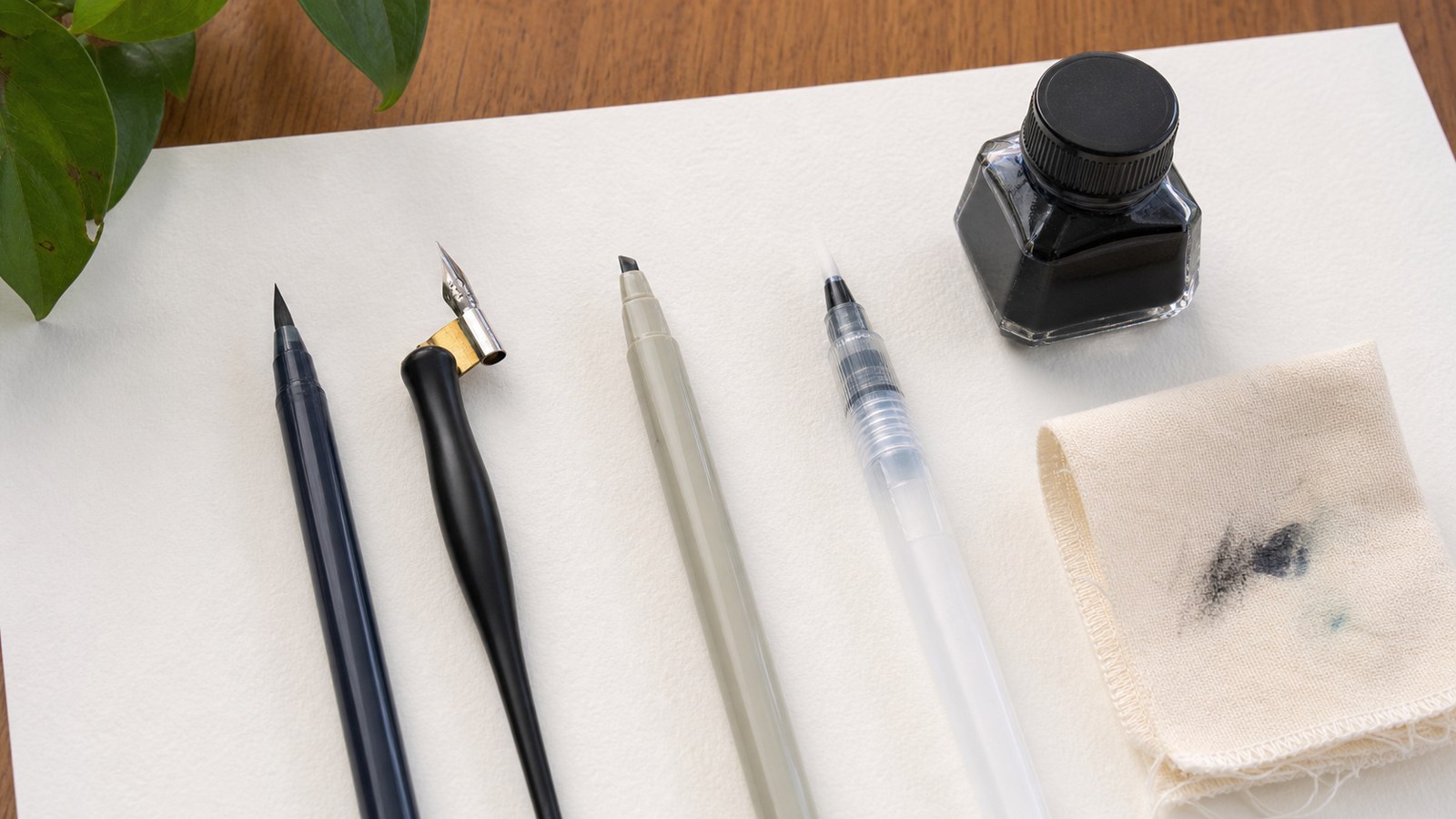
Calligraphy commonly asks you to observe where a stroke starts, how it changes direction, and how it relates to neighboring forms. Those observations can support both printed and joined handwriting. A decorative brush style also uses deliberate thick-and-thin variation, but that effect is not a requirement for clearer everyday notes. A broad-edge style uses the orientation of its edge in another way. Borrow the relevant principle rather than copying a whole tool-specific system into your notebook. For an unclear e, that principle may be preserving an opening; for drifting words, it may be maintaining a baseline. A plain monoline exercise can practice either skill with your normal writing pen.
Stabilize the writing zone before changing the alphabet
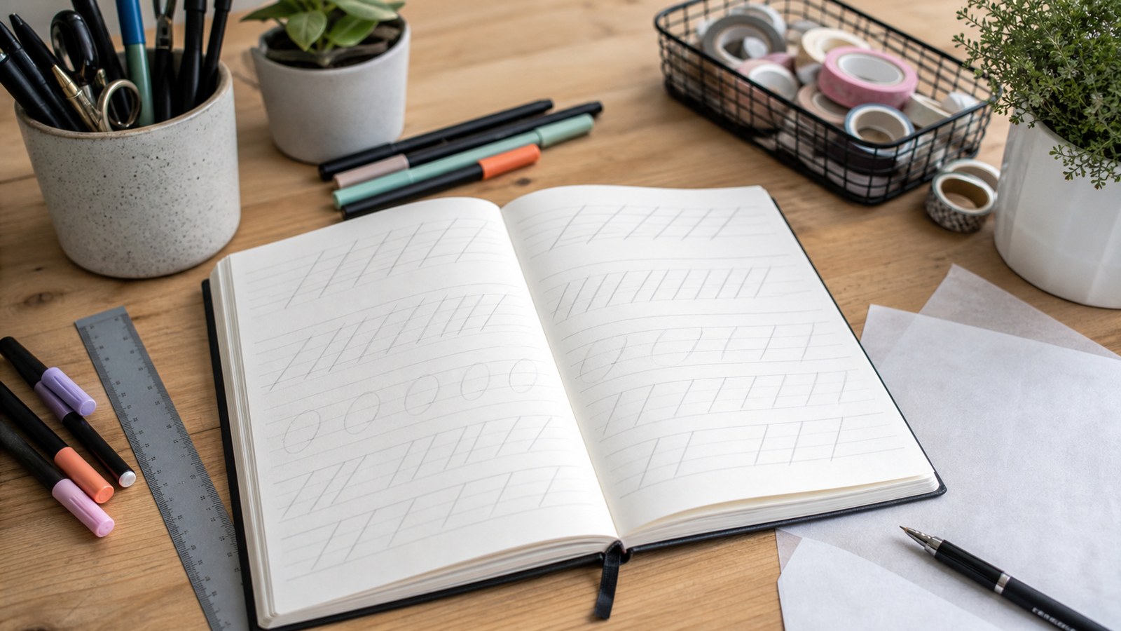
Use a baseline and a light upper guide to define the main lowercase zone. Allow additional space for taller stems and letters that descend below the line. Begin with familiar words, checking whether related lowercase bodies occupy roughly comparable heights. You are not trying to make every letter identical: an ascender and a rounded body perform different jobs. The guides simply make an unexpected rise or shrinkage easier to notice.
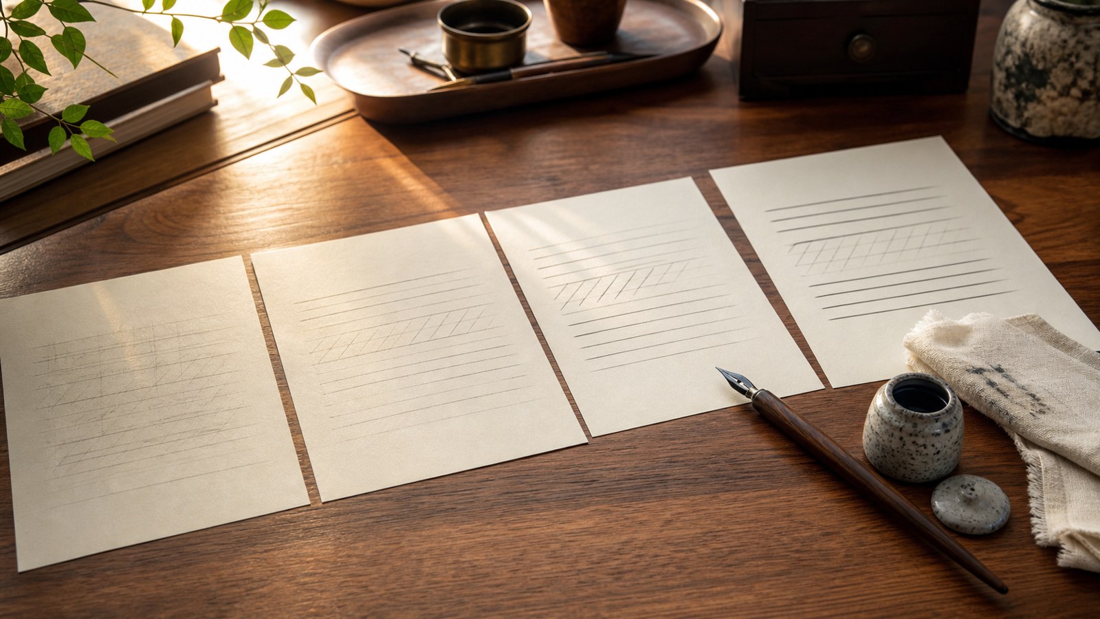
If your ordinary paper is ruled, use its existing line as the baseline instead of covering the page with new measurements. A light pencil guide can help during a drill, then disappear from later practice. Write a short row of the same word and compare its beginning, middle, and end. If the final letters become smaller or crowd upward, leave more room and shorten the row. Maintaining a workable writing zone is more useful than forcing a long line to fit.
Practice one confusing form and then its neighbors
Suppose your lowercase a sometimes resembles an o. Write three slow versions of each beside one another and inspect the feature that distinguishes them in your chosen style. Preserve that feature deliberately, then place the letters in simple words such as boat and road. The purpose is not to invent an exotic replacement a. It is to make the form you already use sufficiently clear when surrounded by other letters.
For an n that merges into its neighbor, practice the short sequence an, in, and rn with enough space to see each construction. Compare a joined version with one using a small pen lift. A lift is acceptable if it improves clarity without making normal writing awkward. You may retain joins that work well and separate only the troublesome pair. Practical handwriting does not need to prove that every word can be written without lifting the pen.
Finish the drill with an unfamiliar sentence containing the same forms. The sentence reveals whether the correction survives a different position and surrounding rhythm. A neatly repeated a on a practice row is encouraging, but the reader needs to recognize it inside an actual word. If the improvement disappears immediately, return to the pair rather than starting the entire alphabet again. That smaller revision keeps attention on the feature you are learning.
Make letter gaps and word gaps visibly different
A reader needs to see which marks belong to one word. When the space inside a word becomes as large as the space between words, a recognizable sequence can break into fragments. Conversely, crowded words can form an apparently continuous string. Use a short phrase such as near the garden and inspect both kinds of gap. The goal is a consistent visual distinction, not a rigid measurement applied to every pair of letter shapes.
Leave room for the complete word before beginning it. If the final word will not fit comfortably, start it on the next line instead of compressing its last letters against the margin. Check the space after punctuation as well. A full stop needs to be recognizable, and the next sentence needs an evident beginning. These simple arrangement decisions often improve a note without requiring any change to the alphabet’s overall appearance.
Move from a deliberate sample toward your useful pace
Write the same short sentence carefully, then write it again slightly closer to your normal pace. Compare the specific feature you practiced, along with word spacing and any newly ambiguous joins. Increase the pace only while those features remain understandable. This is a comparison exercise, not a speed contest or a promise of rapid motor improvement. Use your usual notebook and pen for the later attempts, because a large calligraphy marker on special paper does not reproduce the conditions of an ordinary meeting note. A slower practice form becomes valuable when you can simplify and retain it during the work you actually do.
Include numbers and names in the transfer test
An attractive paragraph does not establish that a date or address will be clear. Practice a realistic date, a room number, and a name unfamiliar to your reader. Compare characters that can be confused in your own style, such as an open-topped 4 and another hurried numeral. Keep the conventions appropriate to the context in which the note will be used. A personal flourish on a capital is less useful when it conceals the initial of a person’s name.
Use an original practical note such as Meet Rowan in Room 17 at 10:30, and ask someone to repeat the details. The task tests whether the information survives the handwriting, rather than whether the page looks elegant. If they misread the room number, practice that number in context. If they read every detail correctly but dislike the style, distinguish their preference from a communication failure.
Try the same information in a list, a sentence, and a short label. Each arrangement introduces a different spacing challenge. A numeral that remains clear in a generous drill may become compressed beside a colon or inside a narrow box. The test helps you identify a situation where you need more room or a simpler form. It also keeps progress tied to practical tasks instead of to an isolated decorative specimen.
Decide when to keep a personal letter shape
Your current alphabet may include an unusual capital or a simplified join that is perfectly understandable. Keep it when an unfamiliar reader recognizes it reliably and you can write it comfortably. Change a personal form when it repeatedly turns one letter into another or requires so much correction that an ordinary note becomes awkward. Compare alternatives in the same name or sentence before replacing the form everywhere. For example, try two versions of the capital R in Rowan and ask which one is read without hesitation. The useful criterion is the letter’s contribution to this message, rather than resemblance to a decorative model you happen to admire.
Keep practice comfortable and specific
Set up the paper so you can see the line and move comfortably across it. Left- and right-handed writers may prefer different page positions; no single angle should be treated as a compulsory posture for everyone. Notice whether a very tight grip or cramped placement makes the exercise harder to manage. Pause and reposition rather than pushing through a practice row that has become uncomfortable. This guide offers writing exercises, not treatment for pain or a clinical explanation of handwriting difficulty.
A short session can contain a baseline check, a few repetitions of one form, and a normal sentence using it. End with a brief note about what changed: the e stayed open, the date was readable, or the final word no longer crowded the margin. Save a dated example under comparable conditions. Filling several pages after your attention has faded provides less useful feedback than a small sample whose purpose and result you can explain.
Walk through one small practice session
Begin by rewriting the original bowls sentence once with your ordinary pen. If the e in seven still closes, practice a few open e forms beside an n. Compare the opening while keeping the height familiar. This establishes a specific observation rather than a general verdict that the page looks messy.
Use the improved form in three different words, then return to the whole sentence. Leave enough space before starting blue bowls so the last word does not crowd the margin. Inspect the e and the word gaps separately; succeeding at one does not prove that the other is settled.
End with a different short message at a useful pace. Save it beside the original and identify the feature that stayed clearer. If the change did not transfer, keep that information too. The next session can revisit the same pair instead of introducing another alphabet or a more elaborate flourish.
Judge progress by what another person can understand
Compare the later note with the original at a similar pace and size. Ask whether the previously confusing letter or number is now easier to recognize without prompting, and whether the change remains comfortable in ordinary writing. Keep distinctive forms that communicate clearly; personal handwriting does not need to become a standardized calligraphic alphabet. If a flourish helps a special card, use it there, while letting meeting notes remain simpler. The useful contribution of calligraphy is the habit of deliberate attention: observe a form, practice its important feature, and bring that feature back into a meaningful message. Clearer everyday writing grows from that transfer, not from decoration alone.