The best beginner pen depends on the letters you want to make
A small brush-lettered notebook heading, a broad-edge alphabet, and a drawn monoline label require different tools. Comparing their pens as if one must win every task makes the buying decision harder rather than clearer. Begin with the method you want to learn, the size of the letters, and the amount of setup you can realistically manage. This guide compares Tombow Fudenosuke, Tombow Dual Brush Pen, and Pilot Parallel as three useful starting directions, then explains when a fine-tip pen or dip-nib kit serves another purpose. Product details are checked against manufacturer information; the selection advice follows the mechanisms and intended practice, rather than pretending to be a measured hands-on ranking. You will also find a repeatable pen trial and an original first-project comparison. The goal is one suitable tool and appropriate paper that let you finish something, not an expensive collection assembled before the first practice row.
A: There is no universal choice; brush, pointed, and broad-edge methods require different tools.
A: Tombow offers hard and soft flexible tips with different feel and control.
A: Its brush end allows larger pressure-based forms, while its fine end offers another working mode.
A: No. Its broad-edge mechanism teaches a different approach to stroke formation.
A: Yes. You can draw and fill added stroke width instead of producing it through pressure.
A: Comfort, repeatability, paper compatibility, and the scale of your intended lettering.
A: No. Excess force can reduce control and stress the tip.
A: The writing surface affects control, appearance, and flexible-tip wear.
A: A small selection is enough to learn the mechanism and finish an initial project.
A: Check compatible supplies, cleaning requirements, and the setup your routine can accommodate.
Choose between pressure, edge orientation, and drawn width
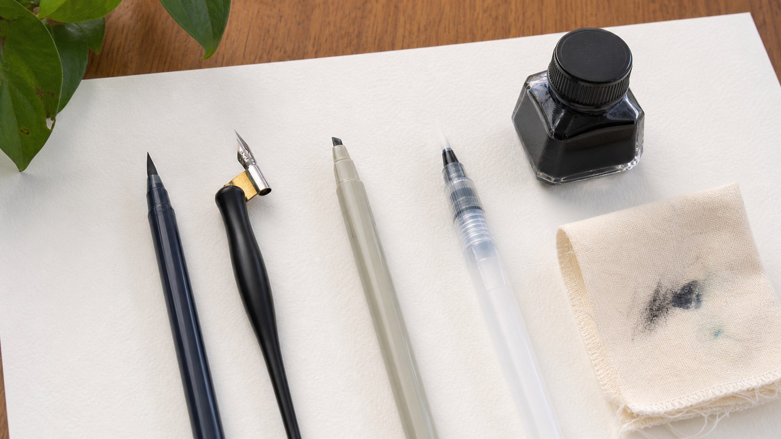
A flexible brush tip changes the mark as pressure and movement change. In a common Latin brush-calligraphy approach, light upward movement and controlled heavier downward movement create contrast. A broad-edge pen instead uses the relationship between its edge and the direction of travel. A fixed-width drawing pen can outline or add width in separate passes. These are different constructions, not successive levels in a universal beginner-to-expert ladder.
Identify the model you intend to practice before selecting a tool. A pointed-pressure worksheet may frustrate you with a broad-edge pen, while a broad-edge alphabet depends on a different set of instructions. If you want to draw block letters and refine their outlines, a pencil and drawing pen may be the better starting equipment. The word calligraphy on a package does not guarantee that its mechanism matches every calligraphic tradition.
Tombow Fudenosuke: a compact brush direction
Tombow’s Fudenosuke information identifies a flexible elastomer tip and hard and soft options. Consider the hard-tip version when you want to investigate a firmer response for small brush forms; compare the soft version if you prefer a different feel. Hard does not mean a rigid monoline nib, and soft does not automatically mean easier. Your control and the scale of the model matter more than the label alone.
Use a compact word such as fern for a trial. Observe whether you can make a restrained thin stroke, a repeatable thicker stroke, and an open e at the intended size. If both tip options are available to try, use the same paper and lettering scale. Compare repeated marks rather than the most attractive isolated attempt. This gives you evidence about your own handling without requiring a claim that one version is objectively best for all beginners.
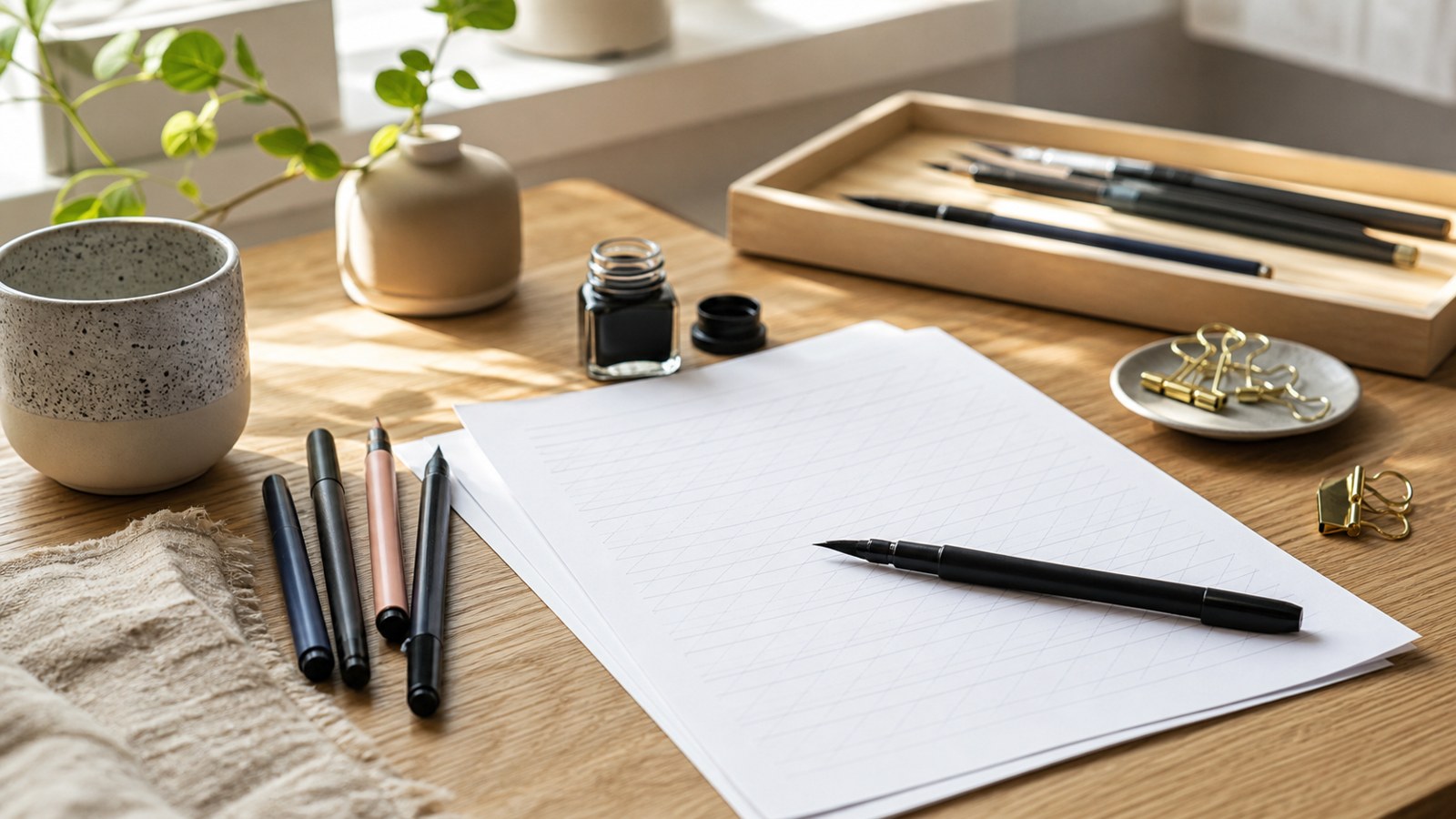
A compact brush pen is a plausible first direction for notebook headings or small cards, provided the model fits its range. Start with one suitable dark color and paper rather than treating a large assortment as a requirement. If the forms become cramped, enlarge the practice before pressing harder. A smaller tool still needs enough room for its curves and interior spaces.
Tombow Dual Brush Pen: room for a larger practice scale
The ABT Dual Brush Pen combines a brush end with a finer end. That gives you two working modes, including pressure-based marks and finer monoline work. Compare it as a larger brush direction rather than expecting it to reproduce every tiny notebook model comfortably. A generous practice sheet can make changes in pressure and curve shape easier to see, while the fine end can serve a separate drawn-lettering task.
For an original greeting-card exercise, set the word welcome large enough to preserve its openings and connections. Sketch the arrangement first, then test the brush movement on spare paper at that scale. The finer end can support small supporting words or a constructed faux-calligraphy treatment, but using both ends does not mean they should imitate each other. Assign a clear role to each. A twin-ended tool is useful when those roles match your project, not simply because it offers more tips in one barrel.
Pilot Parallel: a broad-edge method rather than a brush substitute
Pilot’s Parallel instructions describe its parallel-plate mechanism. The broad edge makes it a different learning direction from a pressure-sensitive brush tip. Choose it when the alphabet you want to study is taught through a broad-edge method, and match the nib width to the model’s proportions.
The same nominal letter height can be unsuitable for different nib widths. Follow the supplied method before experimenting with decorative effects. A model’s proportions should remain visible in the sample, rather than disappearing because the tool is much wider than the guide expects.
Try straight, curved, and diagonal movements while holding the edge as the model specifies. The resulting changes teach you about orientation and travel rather than about forcing a brush tip into a heavier downstroke. A beginner interested in broad-edge Roman or italic forms may find this direction more relevant than a brush-marker set. That is a match between tool and goal, not a judgment that one tradition is more advanced or more authentic.
When another tool makes more sense
Pentel’s Sign Pen Brush provides another flexible-tip option to examine if you want a brush comparison beyond Tombow. Sakura’s Pigma Micron is a different kind of candidate for outlining and monoline drawing. Speedball’s Calligraphy Starter Kit introduces C-series nibs, a holder, and ink for a dip-pen route. Inspect the exact package and method before buying. A dip setup introduces filling and cleaning steps that a capped marker does not, while a fixed-width pen will not create brush-style contrast merely through increased pressure. Each can be useful when its mechanism serves the intended practice.
Compare three first projects instead of three advertising claims
Imagine that your first finished task is a small plant label with fern as the main word. A compact brush option deserves a trial if you want pressure contrast, but a drawing pen can be more direct if the design is monoline. Test whether the word remains readable at the label’s actual size. Decorative contrast is optional; a clear name is the practical requirement.
For a card carrying the larger word welcome, the Dual Brush direction offers a different scale to explore. Leave room for the curves before committing to the arrangement. For a broad-edge alphabet study, the Parallel direction matches the method more closely. These three projects explain why a single ranking would obscure the decision. The best first purchase is the one that lets you practice the construction required by the project you intend to finish.
Run a repeatable trial on the paper you will use
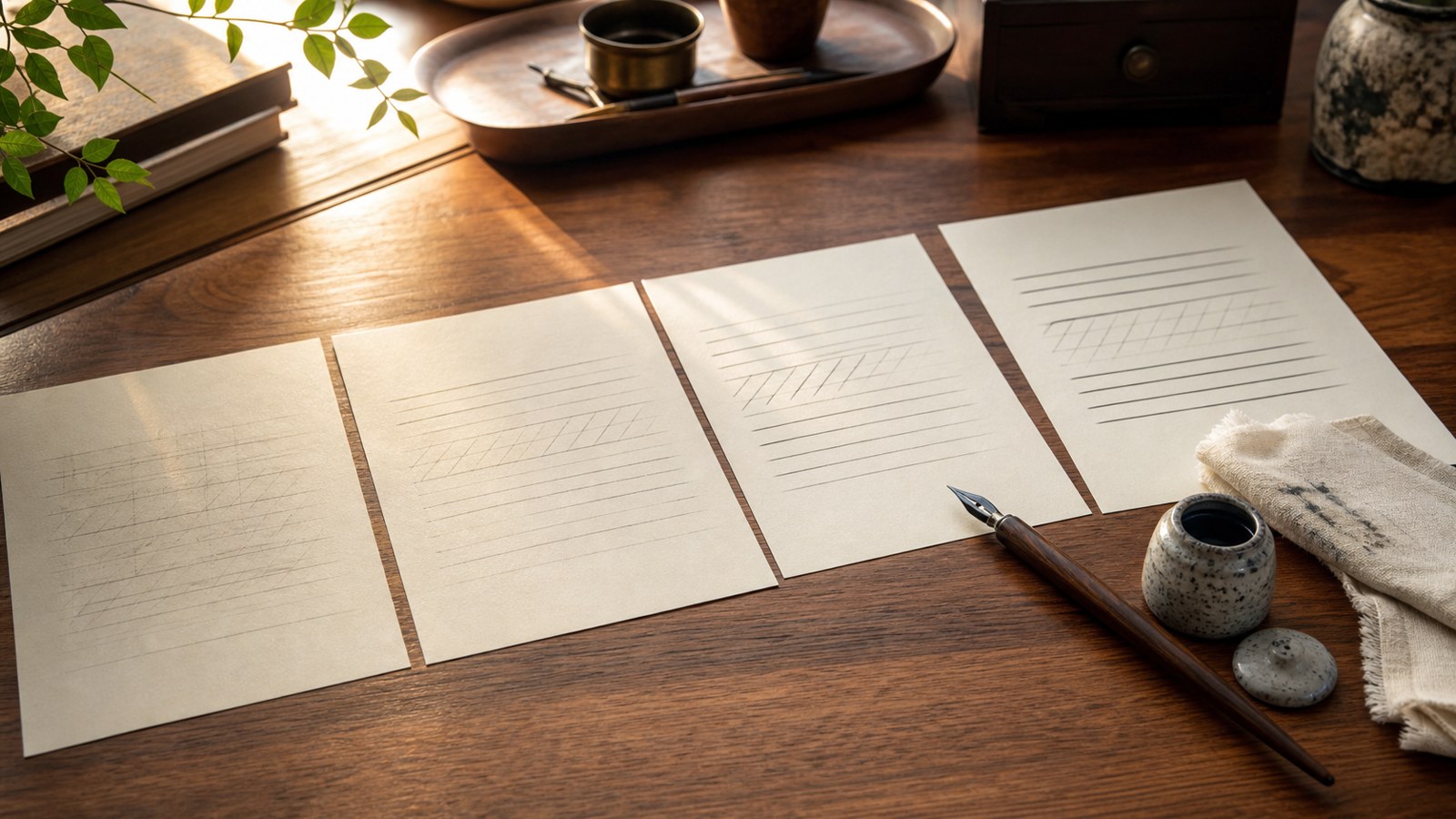
With a brush tool, make several light strokes, several controlled heavier strokes, and a few transitions. Inspect consistency and the clarity of the interior spaces. With a broad-edge tool, use the model’s edge orientation and repeat movements in several directions. With a drawing pen, compare outlines and closely spaced marks. Keep the scale suitable for the mechanism instead of demanding the same tiny specimen from every tool.
Then write the project word more than once. Notice whether the grip remains comfortable, whether the tip reaches the intended corners, and whether the paper causes feathering or an unexpected spread. Do not mistake a single lucky mark for repeatable control. If the surface behaves poorly, repeat the trial on another suitable paper before blaming the pen or your movement. Tool, surface, and practice scale interact in the finished result.
Ask yourself what the sample actually establishes. It can show that this pen and paper combination lets you make the required forms with reasonable control. It cannot establish a universal durability ranking or predict how every other beginner will feel. Keep the observations concrete: the small e stayed open, the edge remained stable, or the outline bled into the next mark. Those details support a purchase decision more usefully than a vague declaration that a pen feels professional.
Include paper and supplies in the practical cost
Compare the cost of a usable setup, including suitable paper and any required ink or cartridges. A refillable tool may reduce repeated replacement in one routine while adding maintenance or supply constraints in another. Check local availability before deciding that a refill system is convenient. Avoid quoting a temporary sale price as a permanent value ranking; prices and package contents can change, and the relevant comparison is the setup you can actually obtain.
Use care instructions that belong to the mechanism
Replace caps promptly and consult the maker’s storage and care guidance for the exact pen. Protect flexible tips from unsuitable rough surfaces and excessive force. Do not assume that a cleaning method for a metal dip nib applies to a marker tip or an enclosed cartridge system. The tools have different materials and ink paths. A short look at the supplied instructions can prevent an improvised remedy from creating a new problem.
Use compatible ink and refills in a refillable mechanism. A bottle suitable for an open dip nib is not automatically suitable for a fountain-style feed. Keep trial paper and finished artwork separate during filling or cleaning. If a pen’s marks become inconsistent, inspect the tip and ink flow before repeating an entire worksheet. A worn or damaged component and an unfamiliar movement can both affect the result, and they need different responses.
Check handling without copying another writer's grip
Observe whether your hand can travel through the required movement while the paper remains visible and stable. A demonstrator’s page angle or grip may not be comfortable for you, particularly when writing with a different hand or at another scale. Reposition the page and compare a short row before treating that difficulty as a reason to buy another pen. For the broad-edge trial, keep the model’s edge relationship in view; for the brush trial, leave room for the tip to move without an increasingly tight grip. The useful question is whether the setup lets you make the intended forms consistently, not whether your fingers look identical to someone’s demonstration. A short realistic trial can reveal a handling mismatch that a product photograph and an attractive barrel cannot answer.
Make a small purchase and finish a real piece
For small brush practice, start by comparing the Fudenosuke tip response with your intended model. For larger brush forms and a separate fine-tip role, examine the Dual Brush option. For an appropriate broad-edge alphabet, consider the Parallel method. These are conditional recommendations based on the jobs the tools perform. They avoid pretending that three different mechanisms have competed in one uniform test.
Finish the plant label, greeting card, or alphabet study before adding another pen category. The finished piece will reveal whether you need a smaller tip, a different method, or simply better spacing and more practice. Keep the trial beside it and note the limitation you want the next tool to address. A new purchase should solve an observed problem rather than restart an appealing search through colors and packaging.
The most useful beginner comparison ends with a clear match between method, scale, surface, and routine. Manufacturer information tells you what a tool is designed to do; your realistic trial tells you how that design serves your own project. Choose one plausible option, learn its care requirements, and make something readable. That gives the word best a practical meaning you can explain, instead of treating it as a universal label on a pen.