Make a message occupy real space
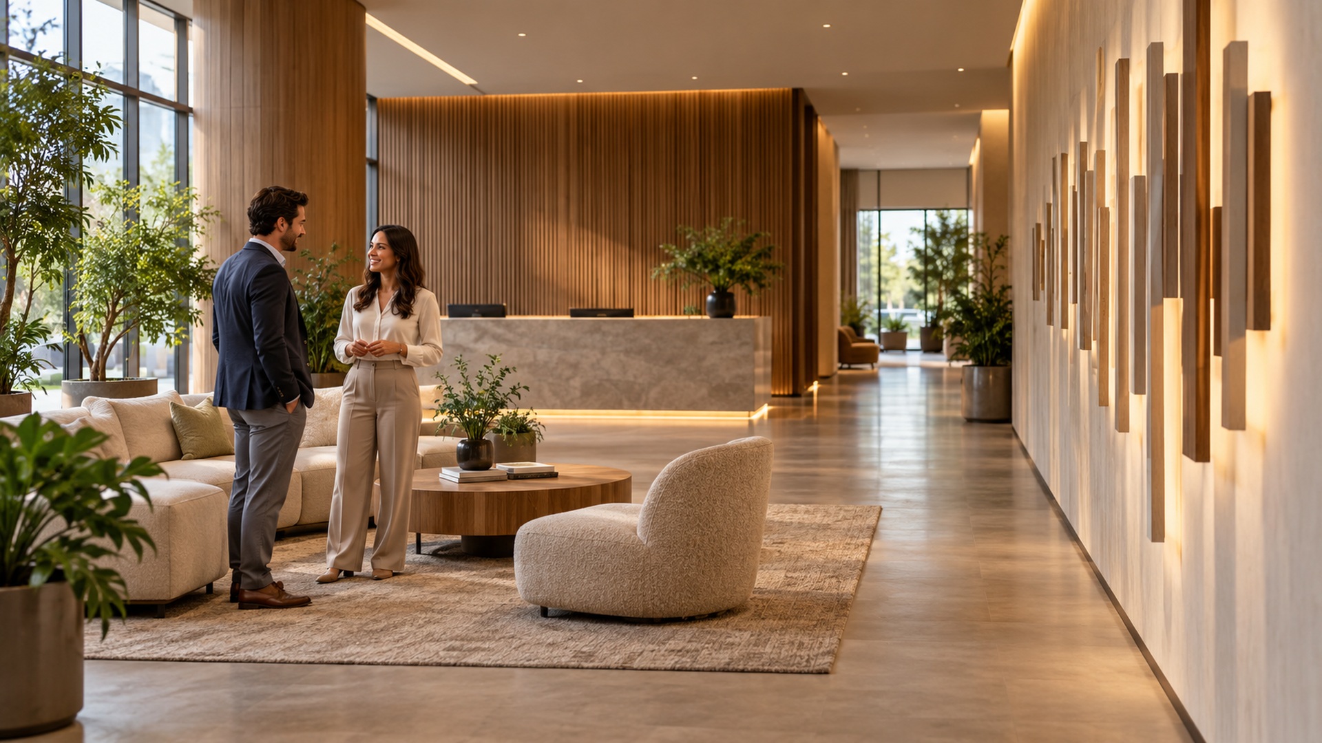
A word on a screen has a fixed frame; a word built in three dimensions shares the room with its audience. People approach it from different directions, notice its shadow, stand beside it, and judge its scale against their own bodies. That makes custom 3D letters a particularly versatile form of communication, whether the goal is a welcoming lobby, a memorable event backdrop, or a permanent place marker. It also makes the project more complicated than enlarging a font and choosing a paint color. A successful display balances readable language with proportion, construction, lighting, installation, and the practical life of the object after opening day. For a business owner, designer, or venue team commissioning letters for the first time, the most useful starting point is the intended encounter: who will see the display, where they will stand, what they should understand, and how the installation will support that experience.
A: Depth changes shadows and side views; its value depends on sightlines and the available footprint.
A: Often, but thin strokes and connections may need approved adaptations or concealed support.
A: A shared base can simplify alignment, while separate bases may improve modular transport; review both visually.
A: No. Appearance and structural material are different specifications that should be documented separately.
A: Use a dimensioned drawing and a full-size site mockup rather than relying only on a rendering.
A: That intended interaction must be considered by the fabricator and installer when specifying the structure.
A: Include the letter bodies, supports, finish, packing, freight, site work, and assembly scope.
A: Lighting, exposure, and processing change apparent color, so approve a physical sample.
A: Plan modularity, protective packing, handling, and each venue's installation conditions before commissioning.
A: Keep approved drawings, finish references, care instructions, assembly records, and service contact details.
Decide what the display should accomplish
Begin with a communication goal that can guide decisions when attractive options compete. A lobby identifier should make a destination unmistakable, while an event photo feature may need to bring several people into a comfortable frame. A retail installation might emphasize one short campaign phrase rather than reproduce the entire company identity. Those purposes lead to different choices about height, position, background, and surrounding space. Write a brief description of the desired encounter before collecting visual references, so the project has a clear reason for taking physical form.
Consider what the audience already knows. Familiar initials may communicate effectively to employees but leave first-time visitors uncertain; a full name may clarify identity while demanding substantially more width. A poetic phrase can reward close attention in a gallery but disappoint when people must identify an entrance from a moving vehicle. If several departments want different messages, establish which one takes priority at the main viewing position. Custom fabrication can solve many geometric problems, but it cannot make every competing sentence equally prominent within a limited footprint.
Scale the word for the place and the viewer
Consider a hypothetical OPEN display for a lobby with a 3.2-metre-wide wall. A preliminary layout might show a word 2.4 metres wide, letters 0.6 metres high, and bodies 0.15 metres deep. Those are illustrative design dimensions, not specifications for stability or access. The drawing must also show the complete base footprint, which may extend beyond the visible letters, and its relationship to the desk and doorway. Ask the fabricator to dimension each component and the assembled word. This makes the proposal reviewable: the team can mark the actual occupied space rather than guessing how large a perspective rendering will feel.
Test the message from the actual approach paths whenever possible. Tape a full-size outline onto a wall, use a temporary paper mockup, or mark the proposed floor footprint before fabrication. Check what becomes hidden when visitors stand in front, when a door opens, or when an adjacent booth is installed. A display that reads perfectly from one centered position can become confusing from the side, especially if deep letter bodies overlap visually. The exercise should include seated viewing positions and the height of children when those audiences are expected.
For photography, plan the scene around the letters as well as the letters themselves. A person may need to stand beside a word rather than directly in front of it, and a group may need a clear strip of floor beyond the base. Background clutter can make a carefully fabricated display disappear in a picture. Test a phone camera from the likely position and check whether the whole message fits without an awkwardly wide lens. Keep the photographer’s position out of doorways and circulation routes so using the display does not obstruct everyone else.
Translate typography into buildable geometry
A typeface designed for print is a starting point, not a guarantee of a successful freestanding object. Thin strokes, delicate terminals, tiny counters, and narrow connections may need modification when enlarged and given depth. The fabrication team should explain which details can be preserved and which require strengthening or a different construction method. Review those changes as part of the visual design rather than treating them as invisible technical adjustments. A thicker connection can alter the character of a letter, particularly in scripts or high-contrast serif styles.
Spacing also deserves an optical review. Equal measured gaps do not necessarily look equal because rounded and diagonal forms create different pockets of empty space. Inspect the complete word from the main viewing distance before approving individual characters. Deep bodies can add shadows that change apparent spacing, and a common base can introduce its own visual rhythm. Where exact brand typography is required, supply approved artwork and identify the person authorized to accept production changes. That avoids expensive disagreement after a physical interpretation has already been built.
Choose materials as part of a complete assembly
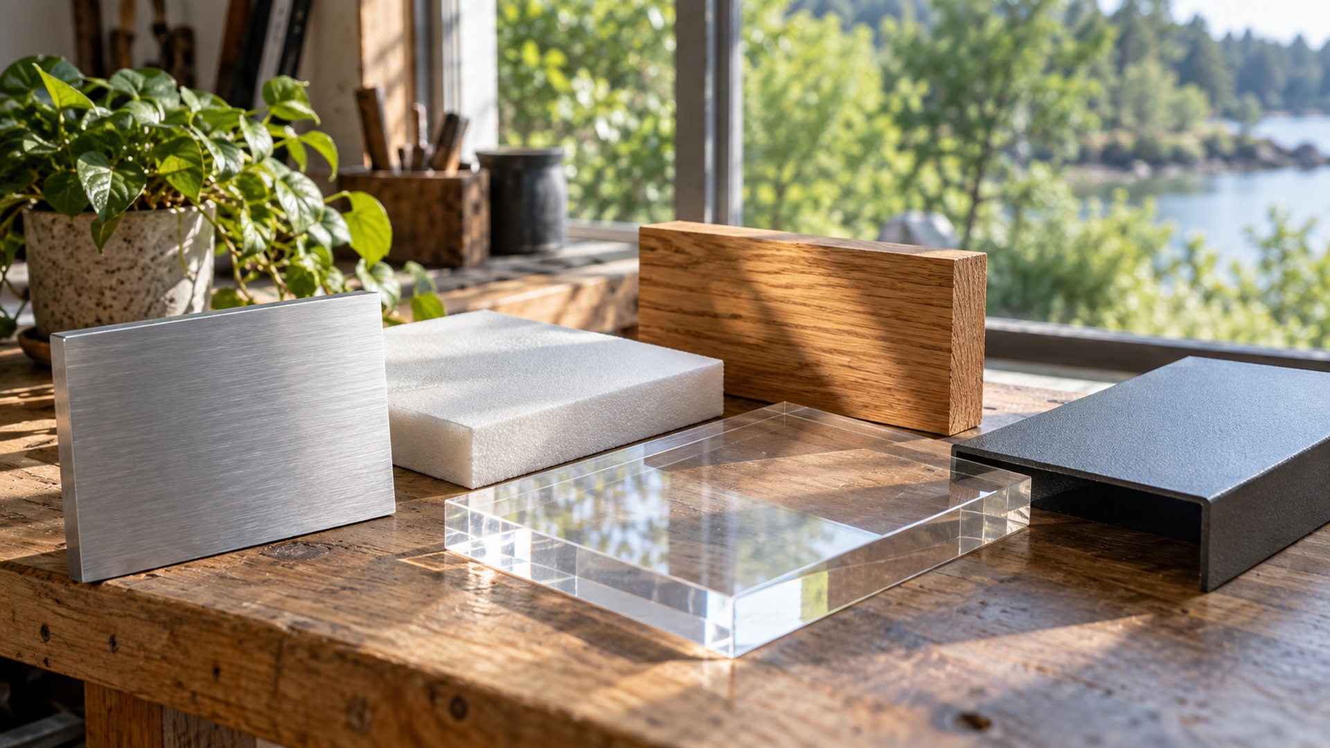
Material selection should follow the expected use, not a simple ranking of impressive-looking finishes. Lightweight foam can suit a large temporary interior display; fabricated metal may suit a lasting exterior installation; acrylic or wood may support particular surface and lighting effects. Yet the visible substrate is only part of the object. Frames, bases, fasteners, coatings, adhesives, and electrical components influence durability and handling as much as the face material does. Ask how the entire assembly responds to the planned environment and whether any exposed edges or hidden components require special care. A convincing metallic appearance, for example, does not by itself identify a metal structure or establish its suitability for public contact.
Use finish and light to reveal the dimension
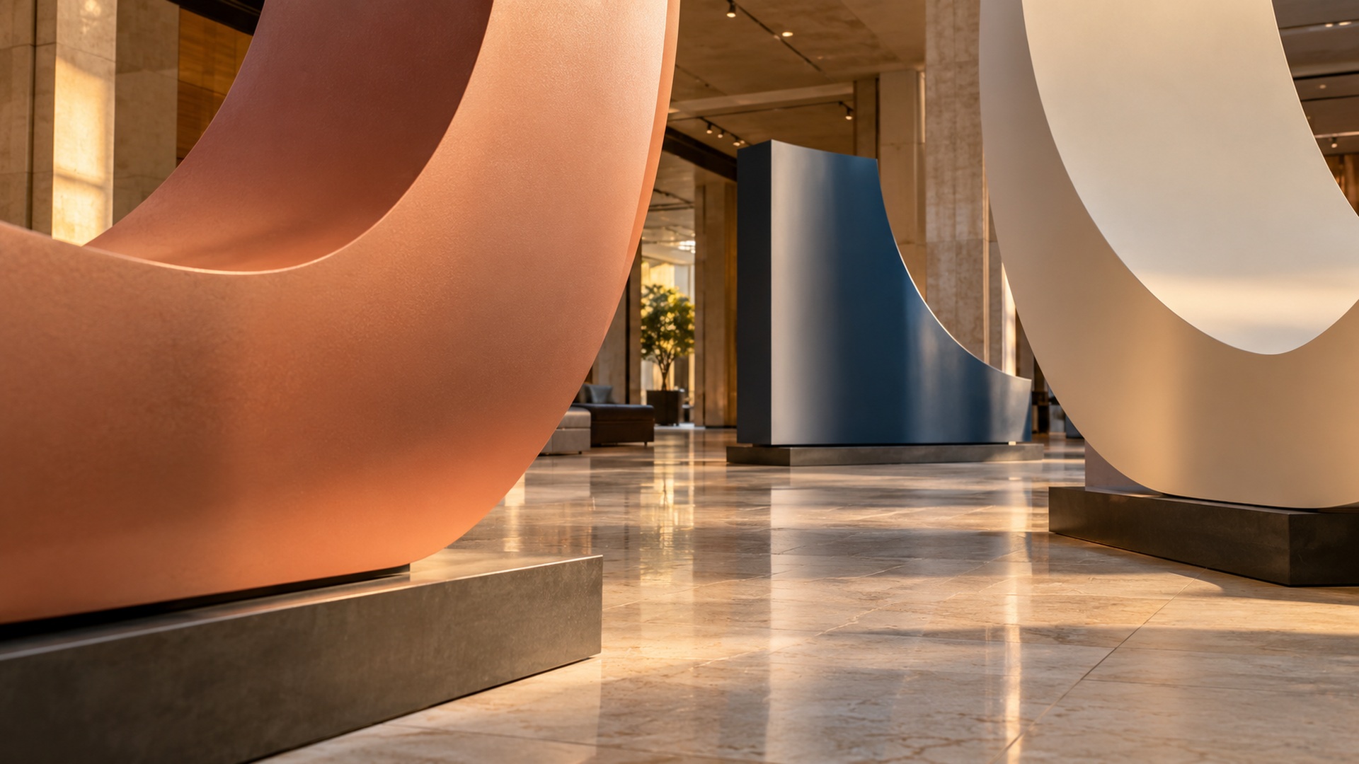
Color should be approved on a physical sample whenever its accuracy matters. A monitor preview cannot reproduce every effect of gloss, texture, surrounding light, or a reflective surface. Compare the sample under conditions close to the installation, especially when a display will sit beneath warm lamps or alongside daylight. Include the edge and side treatment in the approval because viewers will see more than the front face. A contrasting return can emphasize depth, while a matching finish can make the letter read as one solid volume.
Lighting can clarify the word or compete with it. Grazing illumination exaggerates texture and shadow; frontal lighting can make a shape feel flatter; concealed backlighting can separate a mounted letter from its background. These effects depend on distance, surrounding finishes, and the brightness of the room. Test the intended effect with the actual wall color or a representative sample instead of assuming a studio photograph will transfer directly. Avoid using brightness alone to compensate for poor contrast or an obstructed viewing position.
If illumination is integrated, discuss access before approving the object. Someone must eventually reach connections, replace components, inspect weather seals, or troubleshoot a failed section. Agree on where power will enter and how cables will be concealed without becoming inaccessible. For an event, confirm the venue’s power arrangements and restrictions with its team; for a lasting installation, coordinate the electrical scope with the appropriate installer. A beautiful illuminated display becomes frustrating when servicing one small component requires removing an entire word.
Resolve installation before the letters leave the shop
Freestanding does not mean automatically stable in every setting. Letter shapes have different centers of mass and contact areas, while an audience can introduce forces that a static rendering never shows. Explain whether people may touch, lean against, or move the display, and require an installation approach suited to those conditions. The manufacturer and installer should determine the necessary bases, supports, ballast, or anchoring for the actual site. Treat drawings of a base as part of the display approval, because the support can affect both the appearance and the visitor’s path.
Access is an equally important constraint. Measure the narrowest door, the usable elevator opening, the loading route, and any turns between delivery and the final location. A letter that fits comfortably in a lobby may not pass through the route that leads there. Modular construction can help, but seams and assembly steps need planning rather than improvisation during setup. Establish who receives the shipment, which equipment is available, where the crate can be opened, and who has authority to accept the installed position. These decisions protect the finish and keep the opening schedule realistic.
Compare proposals beyond the face price
Two quotations are comparable only when they describe substantially the same deliverable. Check whether each includes artwork preparation, structural components, finish samples, mounting hardware, lighting, packing, freight, and installation. An inexpensive set of letter bodies may become costly if the receiving team must design bases or arrange specialized handling after delivery. Ask for a clear list of inclusions and exclusions, then compare the installed outcome. Budget decisions become more useful when they reveal which features can change without undermining the communication goal.
The approval sequence also affects cost and timing. Late changes to a word, typeface, size, or mounting arrangement can alter fabrication well beyond the visible detail being changed. Decide who consolidates feedback and keep a record of the approved version. Build time is only one part of the schedule; samples, revisions, coating cure, crating, transit, and installation can each consume time. Work backward from the date the display must be usable, allowing space for decisions and coordination rather than treating the delivery date as the only milestone.
For a repeat-use installation, include storage and maintenance in the purchasing decision. A compact modular display may cost more initially but require less freight and less warehouse space across several events. Replaceable finish panels or accessible lighting may also reduce later disruption. Ask what repairs can be done locally and what damage would require returning components to the fabricator. Avoid assumptions about unlimited reuse: handling frequency, packing discipline, and the installation environment will influence how long the object retains an acceptable appearance.
Leave room for more than one way of seeing
Review the display with people whose height, mobility, and familiarity with the setting differ from the commissioning team’s. A word positioned beyond furniture may be easy to read while standing yet partially obscured from a seated approach. A highly reflective surface can lose contrast from an unexpected direction, and a photo feature may be difficult to use when its only comfortable position requires stepping onto a raised platform. These observations can guide changes to placement, background, or the space around the letters without abandoning the concept. Consider how the message works with other information in the venue as well: a sculptural treatment can establish identity while a separate clear sign provides practical directions. The aim is a display that more visitors can recognize and enjoy in their ordinary encounter with the place.
Hand over a display that people can use and care for
At installation, give a colleague who has not followed the project a practical task: find the reception desk from the entrance, then take a photograph containing the entire word. Watch where they pause, whether the name remains visible, and where they choose to stand. Check the display with the normal furniture and lighting in use. A successful shop inspection does not establish that the message works in its final surroundings. Record any agreed positioning change on the installed layout so the next event crew can reproduce it.
Hand the owner a short operating record alongside the finished letters. It should identify the approved layout, packing order, finish-care instructions, service contacts, and components that staff may remove themselves. For the hypothetical OPEN display, a photograph of each packed character and a labelled base drawing would be more useful than another attractive rendering. Agree who retains these records and checks the installation before reuse. The project is complete when the organization can keep the display legible and presentable through ordinary operation, rather than relying on the commissioning team’s memory.