Give the letters a job in the customer journey
A business can buy a striking dimensional sign and still leave visitors unsure where to go, what the company offers, or why the space feels memorable. Standing out is therefore a design problem before it is a fabrication problem. Three-dimensional letters work best when their physical presence supports a useful moment in the customer’s journey: finding an entrance, understanding a place, gathering for a photograph, discovering a product, or recognizing the character of a brand. Depth, shadow, texture, light, and scale give a designer more expressive options than a flat graphic, but those options need a clear purpose. This guide explores business display ideas through the situations they can improve, with attention to the wording and setting that make each idea credible. The goal is not to fill every wall with a slogan. It is to choose a few well-placed dimensional messages that make the business easier to recognize and more rewarding to experience.
A: Identify the customer encounter the display should improve and the message required at that point.
A: Distinctive placement, proportion, finish, and useful communication can matter more than maximum size.
A: It can, provided both functions remain legible and the photo activity does not obstruct arrival.
A: Use language that establishes identity or welcome clearly and fits the organization's actual character.
A: Keep their wording concise and give them a clear role in the hierarchy around the merchandise.
A: A specific statement employees recognize in real practice is usually a more credible starting point.
A: Adaptable proportions, modular construction, appropriate packing, and a message useful across planned venues.
A: No. Contrast, atmosphere, glare, and surrounding lighting determine how effectively the word is perceived.
A: Observe recognition, movement, use, cleaning, and audience response against the display's original goal.
A: Review it when offerings or audience needs change, even if the physical letters remain in good condition.
Make the entrance understandable before making it dramatic
An entrance display has a straightforward responsibility: help the intended visitor identify the right destination. Use a clear business name or familiar mark in a position that remains visible along the main approach. Dimensional depth can separate the letters from the building surface, and considered lighting can support recognition after daylight fades. The design should still work when the lighting is off or when weather changes the background. Review the entrance from the places people actually arrive, including parking areas, paths, and nearby transit stops when relevant.
For a fictional shop called Lark Books, the entrance letters could spell the business name while a window display carries “Find Your Next Chapter.” The two phrases have different jobs: the name identifies the destination, while the campaign line invites browsing. Put the name where visitors approach and check whether the door, delivery activity, or a neighbouring sign obscures it. Reserve the expressive phrase for a position where people have time to read. This hierarchy lets the shop develop a distinctive voice without asking an unfamiliar visitor to infer which words identify the business.
Build a reception feature around a confident welcome
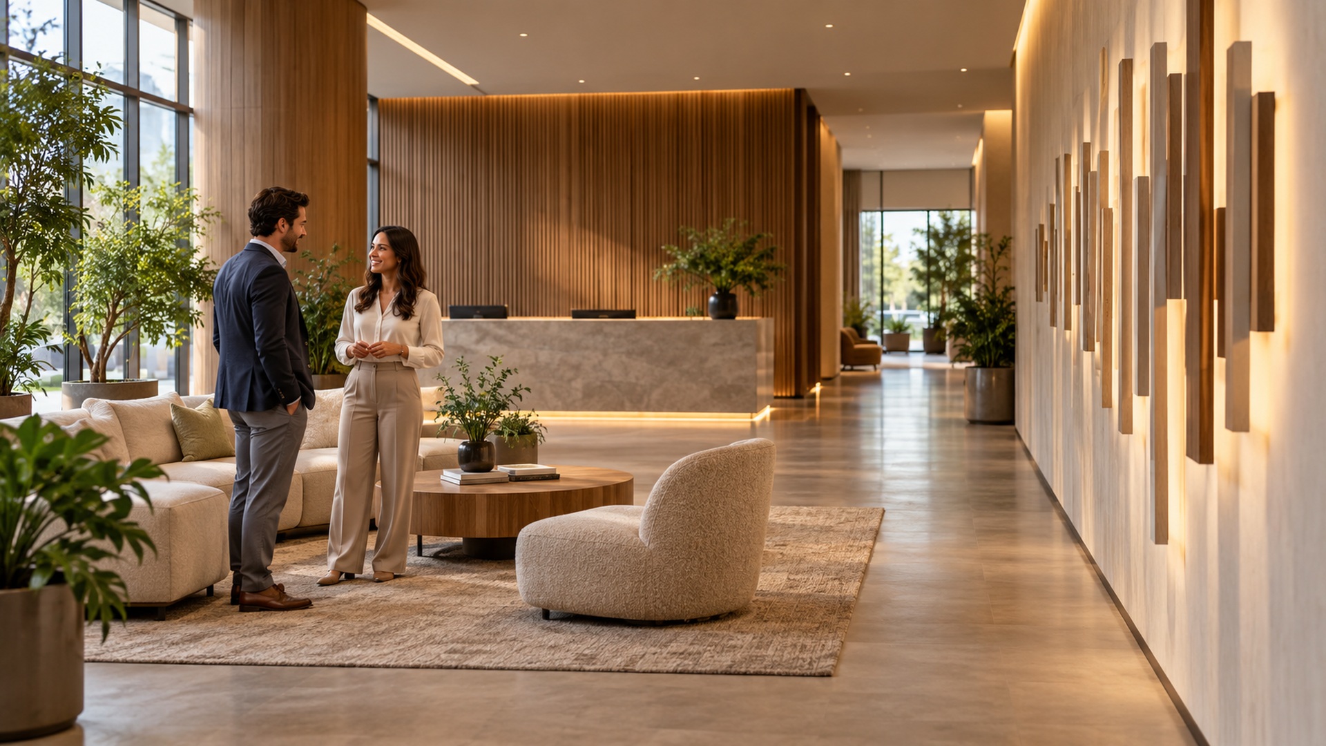
A dimensional name behind reception can anchor a space and establish identity without covering it in graphics. Choose a scale that relates to the desk, wall, and viewing distance, then use depth and surface treatment to make the name feel integrated with the architecture. A shadow gap can produce quiet definition, while a contrasting face can make recognition immediate. Review the installation with the desk and furniture in position rather than approving an isolated wall image. The visitor sees a composition, not a separate product floating in an empty rendering.
A fictional studio called Tern Design could use its name behind reception and a smaller “Welcome to the studio” message beside the waiting area. Treat the name as the anchor and the welcome as a secondary encounter. On the dimensioned layout, show the desk’s actual height and test whether its equipment hides the lower strokes from the entrance. A warm timber finish might suit the proposed room, but approve it against the real wall and furniture rather than treating warmth as an automatic property of a material. The wording and placement should express this business’s character through a coherent scene.
Lighting should support the whole reception scene. Highly reflective letters can become difficult to photograph under strong windows or overhead fixtures, while excessive illumination can dominate a calm waiting area. Test the finish and light together and check the view from seated positions. If the wall appears in video calls or client photographs, consider the background clutter and likely camera framing. A reception feature can become a consistent visual signature when it is easy to recognize across those ordinary interactions, rather than only in one carefully staged marketing photograph.
Create a photo spot with room for people
A freestanding business name or short campaign word can invite photographs, but a useful photo spot includes more than the letters. The setting needs a clear place for subjects, a workable camera position, and a background that does not overwhelm the message. Think about whether individuals, families, colleagues, or groups will use it. A display designed for one person may not suit a team photograph. Mark the footprint and try several frames before committing to a word size that leaves visitors awkwardly hidden behind the characters.
Participation should be inviting without depending on a prescribed pose. People can stand beside a word, gather around a short phrase, or interact with a nearby object that complements the display. Any intended touching, leaning, or seating should be considered in the construction brief rather than assumed after installation. Keep the photograph area clear of circulation conflicts and explain how staff will manage busy periods. A memorable photo feature becomes more valuable when customers can use it comfortably and the business can operate normally around it.
Let a short product message frame a retail moment
In retail, dimensional words can give a product area a clear theme without becoming another layer of visual noise. A carefully chosen category name, collection title, or seasonal phrase can sit above the merchandise and establish a focal point. Keep the wording brief enough to remain readable while shoppers move, and coordinate its scale with the product display rather than copying the proportions of an exterior sign. The letters should create hierarchy: what attracts attention first, what explains the offer, and what the shopper examines next. If prices, product information, and promotional graphics already compete for attention, a restrained dimensional treatment may communicate more effectively than an elaborate illuminated word.
Use material character to express the brand
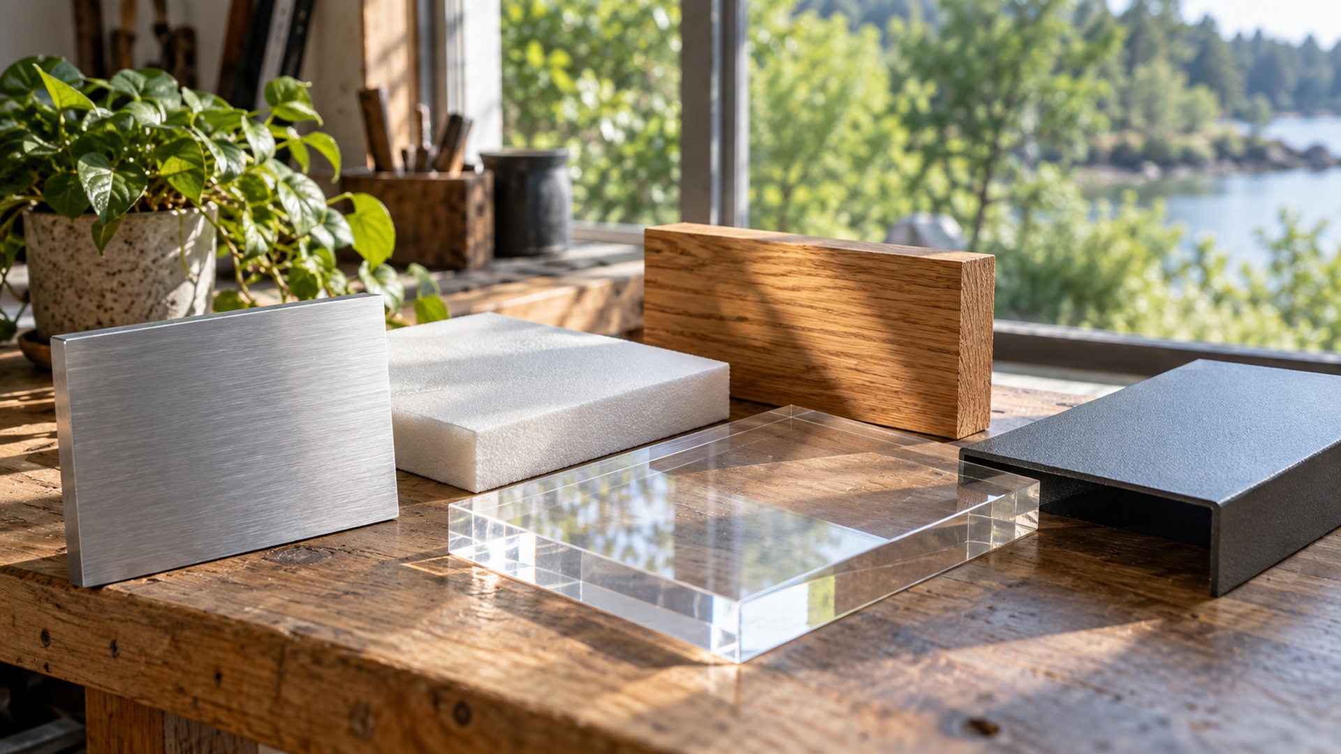
The same word can feel different when its physical treatment changes. A softly painted volume, a precise polished edge, a textured surface, or visible timber grain creates a particular encounter with light and touch. Select those effects because they support the organization’s identity and setting, not because one material is assumed to be universally premium. A business associated with careful craftsmanship might emphasize controlled details and tactile surfaces. Another might use a simple, bold color to create recognition across several locations. The treatment should remain meaningful beyond a fashionable finish trend.
Material character also needs to survive the everyday conditions of the space. A glossy face near a frequently touched counter may show marks; a heavily textured installation may demand more cleaning; a fine projecting stroke may be vulnerable during rearrangement. These practical consequences are part of the design idea. Ask for samples and discuss care with the staff who maintain the area. A finish that fits the brand visually but creates an unmanageable routine can eventually make the business look less attentive, undermining the impression it was chosen to create.
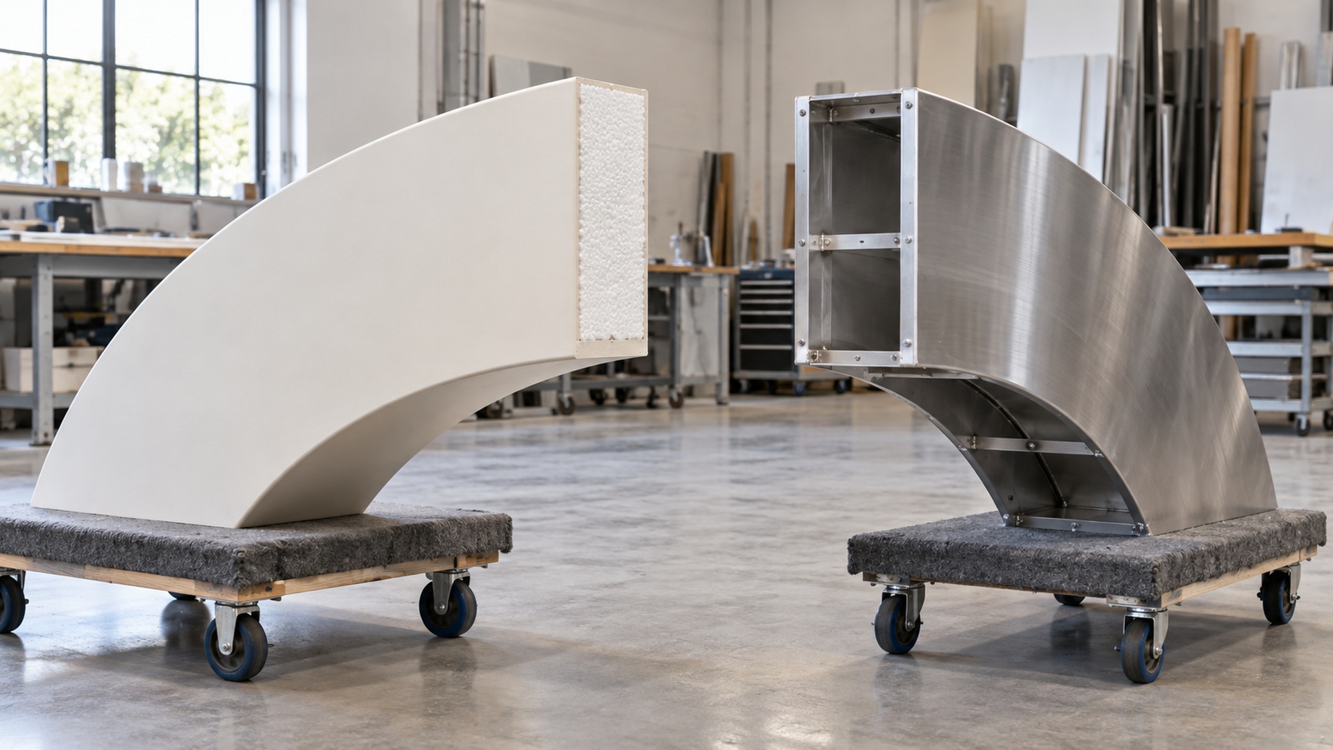
Consistency does not require identical construction everywhere. A touring event display, a permanent storefront, and an interior wall may need different assemblies while sharing recognizable proportions, color, and verbal identity. Define which attributes carry the brand and which can adapt to use. That gives designers and fabricators room to solve practical problems without losing the connection among locations. Keep a record of approved artwork and finish references, and review any production adaptation in its actual setting. A coherent system is easier to maintain than a series of unrelated impressive objects.
Make workplace language specific enough to believe
Dimensional words in an office can celebrate a shared purpose, but generic motivational language often fades into the background. Choose a statement that employees recognize in the organization’s actual work, then place it where its meaning fits the activity. A collaboration area might display a concise principle about how teams solve problems, while a public-facing area may need a clearer explanation of the business. Involve employees in evaluating the wording before treating it as a permanent expression of culture. Their response can reveal whether the phrase feels accurate or merely aspirational.
Keep the installation proportionate to the space and the importance of the message. Large words can dominate a room, so make sure the display leaves room for work, meetings, and changing uses. Consider sound, sightlines, furniture, and maintenance when selecting its position. A thoughtful workplace feature can encourage recognition and conversation, but it should not be presented as a substitute for the behavior the words describe. The business creates credibility through its actions; the lettering can give that established meaning a visible and memorable form.
Design event letters to move with the campaign
For an event campaign built around the word MAKE, sketch three actual compositions: letters behind a demonstration table, a word beside the booth entrance, and a photo arrangement with people beside it. Each sketch should show the complete support and the space occupied by visitors. The same character set can serve several purposes only if it fits those compositions and can be assembled by the available crew. Confirm packed dimensions, access routes, and the joining sequence before purchase. Give the crew a photograph of each approved arrangement. Reuse then means reproducing a tested scene, rather than discovering a new layout during every setup.
Explore light through atmosphere and legibility
Illuminated letters can create an evening focal point or give an interior feature a distinct presence. The effect might be a softly separated word, a glowing face, or a pronounced outline, depending on the construction and surroundings. Choose the effect by testing how people read and experience the space. A restaurant waiting area, a retail aisle, and a corporate lobby can call for different visual intensity. Brightness alone does not guarantee recognition, particularly when other light sources or reflective materials compete with the message.
Plan operation and servicing while the design is still flexible. Decide when the letters will be lit, who controls them, and where components can be reached. Review daytime appearance as well as the night view, because customers may encounter the installation under both conditions. Keep connections and cable routes coordinated with the space so the installation feels complete. An attractive lighting idea becomes a durable business feature when its everyday operation is straightforward and a failed component can be addressed without disrupting the whole area.
Measure whether the idea serves the business
Choose a small set of practical observations before installation. For an entrance, watch whether first-time visitors find the correct door more easily; for a photo feature, observe whether people can use it without blocking circulation; for retail, consider whether the intended product area becomes easier to identify. These observations connect the design to its original purpose. They do not require claiming that a sign alone caused every change in sales or engagement. Staff feedback and simple site observation can reveal improvements or problems that a polished photograph does not show.
Look for unintended effects as well. A word may cast a shadow across nearby information, a base may interfere with cleaning equipment, or a bright face may reflect into a workstation. Resolve those issues while the installation is new, using the agreed construction and service guidance. If the business plans several locations, record what worked and what changed between sites. The next display can then benefit from actual experience instead of repeating an attractive concept without understanding the conditions that made it successful.
A review should also revisit the language. Business offerings, audience expectations, and campaign priorities can change, making an old phrase less useful even when the object remains in good condition. Distinguish permanent identity elements from messages that should be easy to revise. A modular or replaceable approach can support that distinction, but it needs planning before fabrication. The goal is to give the display a useful role over time, with an agreed way to refresh the communication when the business’s needs evolve.
Choose one strong idea and develop it completely
Choose the encounter that most needs improvement and develop its wording and layout first. Lark Books needs a recognizable entrance; Tern Design needs a reception composition; MAKE needs a set of repeatable event arrangements. Each idea can be tested through a specific task, such as finding the door or taking a group photograph. Resolve the scale, finish, lighting, and handling around that task. Dimensional letters earn their place when they make the business easier to recognize or give visitors a useful, enjoyable encounter with its message.