Start with exposure, then select the material
The best material for a three-dimensional letter sign is the one that fits the whole installation, not the one with the most impressive name on a sample board. A sheltered reception wall, a touring exhibition, and a sun-exposed building entrance place very different demands on a display. Moisture, temperature changes, handling, contact, cleaning, lighting, and expected service life can all matter, and several materials often work together within one finished letter. Even indoor and outdoor are broad categories: a damp entry vestibule is unlike a climate-controlled office, while a covered courtyard is unlike an exposed roadside location. For a designer or buyer comparing foam, metal, acrylic, wood, and composite options, the useful task is to translate those conditions into a clear specification. That process makes appearance, construction, and maintenance part of the same decision instead of leaving the installation team to discover the compromises after delivery.
A: No. Foam products differ, and the specific product and complete assembly must suit the exposure.
A: Entrances, condensation, cleaning, and unconditioned rooms can expose interior signs to moisture.
A: The grade, surface, environment, and assembly still affect inspection and cleaning requirements.
A: Acrylic expands and contracts; the selected product's fabrication guidance informs the mounting arrangement.
A: Ask to see the face, a cut edge, and the proposed finish rather than grain alone.
A: It is a broad description; request the product and its actual layered construction.
A: Compare complete assemblies for the same exposure, contact, appearance, and service-life brief.
A: Material transmission, light placement, heat, wiring, and service access become part of the selection.
A: Cleaning is one criterion alongside readability, appearance, construction, installation, and lifespan.
A: A photograph helps, but the supplier also needs the exposure, use, installation, and care conditions.
Describe the conditions the sign will actually face
Begin with a realistic description of the location. Record whether rain can reach the letters, whether water can collect around them, how much direct sunlight they receive, and whether temperatures change substantially over the day. For interior signs, identify condensation, cleaning chemicals, nearby heat sources, and frequent touching rather than assuming the room is harmless. Photographs of the site are useful, but they do not replace a discussion of seasonal conditions. Ask the fabricator which parts of the proposed assembly are sensitive to those conditions and what choices address the exposure.
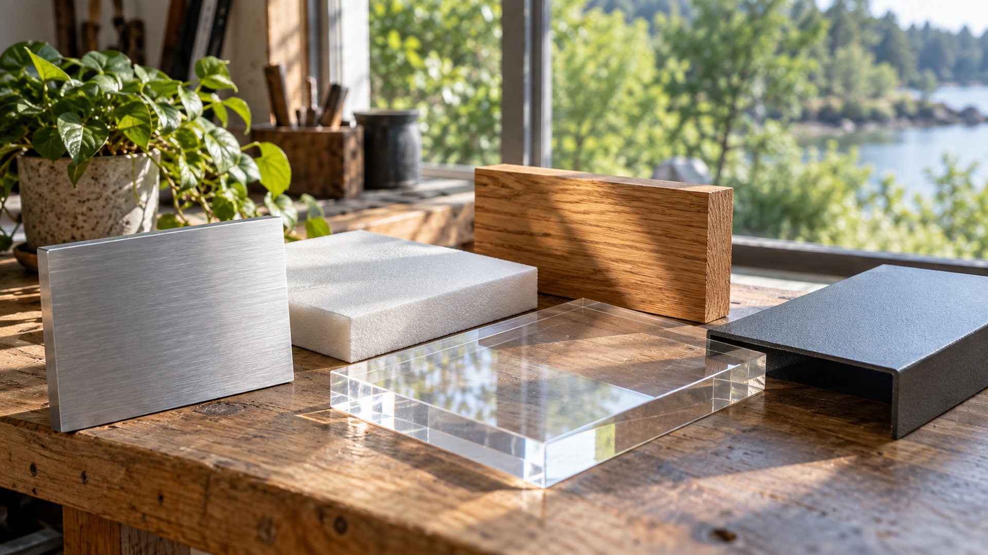
Write two distinct briefs if your project includes both an indoor reception name and an exterior entrance sign. The indoor brief might require a compact wall-mounted name, a textured finish, occasional cleaning, and no illumination. The exterior brief might require a larger illuminated identity exposed to rain and sun, with service access and a documented mounting arrangement. A material that meets the reception brief has not thereby met the entrance brief. Keep each proposal tied to its own conditions and expected life. The following matrix organizes questions for those proposals; it does not rank all products within a material family.
| Assembly direction | Potential purpose | Resolve before approval |
|---|---|---|
| Coated foam | Large temporary display | Exact core, coating, support, and handling limits |
| Fabricated metal | Lasting exposed identity | Alloy, finish, joints, mounting, and maintenance |
| Acrylic face or body | Colour or transmitted light | Grade, expansion allowance, backing, and service access |
| Wood or composite | Texture in a suitable setting | Named substrate, edge treatment, finish, and exposure |
Separate the core, surface, and support
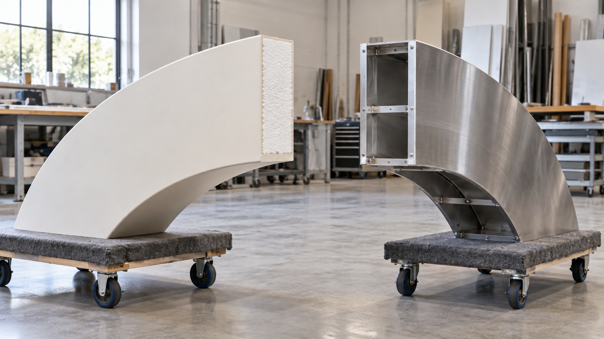
A material label rarely describes everything the buyer receives. A foam letter can have a protective shell and internal support; a metal letter can be hollow with a painted face; an acrylic element can depend on a separate frame or back panel. Coatings, adhesives, fasteners, edge treatments, and drainage details influence the performance of the complete object. Ask for a construction description that identifies those layers and their roles. In particular, do not mistake a finish sample for proof of structural suitability. The right comparison is between complete proposed assemblies used in the same setting, with the same mounting and care expectations, rather than between unrelated pieces of raw material.
Foam options differ more than the name suggests
Foam is a broad family rather than one uniform sign material. Expanded polystyrene shapes, high-density urethane sign board, and paper-faced display panels have different structures and intended uses. For example, Sign·Foam identifies its product as high-density urethane board, while 3A Composites lists Gatorfoam for interior signage and displays. These are examples of why a quotation should specify the actual product or foam type. A familiar nickname cannot establish that two proposed letters have equivalent moisture behavior, surface strength, or installation requirements.
Lightweight foam construction can be valuable when a display must be oversized yet easy to transport. It can also support sculpted forms and painted effects that would be more involved to achieve with another material. However, low weight does not eliminate the need for support or careful handling. Thin projections, exposed edges, and frequent audience contact should be discussed with the fabricator. Ask how the proposed coating and structure address those conditions, and which types of damage can be repaired without rebuilding the entire character.
Outdoor use requires an assembly designed for the intended exposure, not a generic coat of paint applied to any foam shape. The fabricator should explain the protective surface, edge treatment, support arrangement, and care limits for the particular product. A coated sample can help you judge texture and appearance, while written specifications clarify the expected use. Avoid extrapolating a long service life from a short event installation that used a similar visual treatment. Duration, weather, public contact, and maintenance create different demands even when the front surfaces look alike.
Metal choices include construction and finish questions
Metal can support crisp dimensional forms and substantial permanent installations, but aluminum, steel, and stainless steel should not be treated as interchangeable. Alloy, thickness, construction method, joining, finish, and mounting all affect the result. An indoor decorative character may have very different requirements from a large freestanding outdoor letter. Ask why the proposed material is appropriate for the actual location and how any exposed or concealed components are protected. A material comparison should also consider the weight the installation team must manage and the service access needed after mounting.
Surface appearance is another variable. Brushed, polished, painted, and powder-coated treatments produce different reflections and cleaning expectations. A bright finish can look striking in a sample yet lose legibility when it mirrors its surroundings. An exposed environment may demand attention to edges, joints, moisture paths, and the compatibility of connecting materials. These are reasons to request a project-specific finish and assembly description rather than accepting a vague promise of being weatherproof. Agree on what maintenance is expected and which changes in appearance would be considered normal over time.
Acrylic serves light and color when the grade fits
Acrylic can provide translucent faces, clear components, polished edges, and strong color effects. Its suitability depends on the grade, thickness, fabrication details, and how the element is supported. The ACRYLITE sign-fabrication guidance explicitly addresses expansion and contraction, illustrating that a rigid-looking sign face still needs appropriate allowance for movement. Buyers do not need to calculate that allowance themselves, but they should expect the proposed construction to account for the product’s behavior. Ask the fabricator to identify the acrylic and explain its role within the assembly.
Lighting introduces additional selection criteria. The desired appearance may be a uniformly glowing face, an illuminated edge, or a clear element that reveals hardware behind it. Those effects depend on material properties as well as the placement of light sources and the depth available within the letter. Review a representative sample with the intended lighting instead of selecting a translucent color from an unlit swatch alone. Consider how brightness changes the apparent color and whether service panels or wiring will become visible once the object is illuminated.
Close-contact use deserves a separate discussion because clear and glossy surfaces make marks easy to notice. Cleaning products, abrasive cloths, and repeated handling can affect the finish, so obtain care instructions for the exact product. The client should also clarify whether exposed edges are acceptable in the intended setting and how the component will be protected during transport. A transparent material does not make its support disappear automatically. When the construction is visible through a face, the layout of joints, fasteners, and background surfaces becomes part of the visual design.
Wood and composites require precise descriptions
Wood can bring grain, warmth, and a crafted character to interior lettering, while suitable exterior systems can be considered where the product and finish are specified for that use. Solid timber, plywood, fiberboard, and laminated panels are different products with different edge and moisture considerations. Composite is equally broad: it can refer to several unrelated constructions, not a single durability category. Ask for the actual substrate, edge treatment, mounting method, and finish compatibility. Pay particular attention to cut edges and penetrations that a face sample cannot show. A convincing front surface should not distract from the hidden details that govern how the completed letter behaves in its setting.
Maintenance belongs in the selection meeting
Choose an assembly that the owner can realistically maintain. A textured letter high on a wall may collect dust that is difficult to remove, while a polished face at hand height may need frequent attention. Exterior lettering can become harder to reach as landscaping grows or neighboring equipment is added. Discuss how cleaning will happen, what products are permitted, and whether access equipment is needed. The maintenance plan should be practical for the people responsible for the sign, not merely possible under ideal conditions with specialized equipment on call.
Repairability can distinguish otherwise similar proposals. Ask whether a damaged face, failed lighting component, or deteriorated finish can be replaced individually. A modular assembly may allow a targeted repair, whereas a sealed object may need extensive removal to reach one small part. Keep the approved color sample, product identification, and care guidance for future reference. When comparing cost, consider the disruption associated with maintenance as well as the purchase price. An installation that blocks an entrance during every repair creates an operating burden that a simple material table will miss.
Think about replacement without assuming a disposal route
Material choice also affects what happens when a message changes or the display reaches the end of its useful life. Ask whether the letter faces can be removed from the supports, whether individual characters can be reused, and whether the construction can be separated into identifiable components. A product described as recyclable in raw form may be harder to recover when bonded to coatings, adhesives, hardware, or another substrate. Confirm actual local recovery options rather than attaching an environmental claim to a material name. Sometimes a repairable object that continues serving the business is a more practical choice than a lighter object that cannot be adapted, though the answer depends on use and available resources. Keep the assembly information with the owner’s records so a future team can make an informed decision about refurbishment, donation, reconfiguration, or the appropriate disposal pathway.
Use a matched comparison to make the final choice
Give competing fabricators the same brief and ask each to explain its proposed complete solution. Compare the visible quality, expected use, structural arrangement, finish system, transport needs, mounting scope, and maintenance obligations. If one proposal uses a different material, ask which requirement drives that recommendation. A short material shortlist is more useful than a universal ranking because the right answer can change with the scale and placement. Record the reasons for the choice so later revisions do not accidentally remove the feature that made the assembly suitable.
Physical samples help expose differences that technical names conceal. Review the face, edge, corner, and finish under representative lighting, then inspect an assembled detail if the joining method will be visible. For a lit sign, include a powered sample; for a touched installation, discuss how the sample’s surface relates to the completed object. The sample review should answer a specific uncertainty rather than simply confirm that a material looks attractive. Keep appearance approval separate from the fabricator’s documented construction and installation responsibilities.
Record the selected assembly as a specific product and construction, rather than simply “foam” or “metal.” For the reception brief, retain the approved texture sample and cleaning instructions. For the entrance brief, retain the mounting documentation and service arrangement. These records answer different ownership needs. A useful selection leaves the buyer able to explain why that assembly fits that location.