Give the Words a Reason to Be in the Room
A phrase on a wall can make a room feel welcoming, give an overlooked corner a purpose, or invite visitors to think differently about a familiar place. It can also become visual noise when the wording has little connection with the people who use the space. The strongest word art ideas begin with a relationship: between language and daily life, between an object and its setting, or between a public message and the community encountering it. Whether you are planning a modest piece for a home, a workplace installation, or an artwork in a shared outdoor setting, choosing that relationship first makes decisions about scale, style, material, and placement much more coherent. The result should belong to the space rather than merely fill it.
A: Choose a message with a meaningful relationship to the people and setting.
A: Use a personal association or original wording that matters to the household.
A: It can conflict with the daily practices or experiences of the people working there.
A: They can reveal how the message and site are understood beyond the commissioning team's perspective.
A: No. The right form depends on the reading distance, activity, available space, and intended encounter.
A: Use a proportional site mockup and an appropriate temporary size test.
A: Exposure, contact, cleaning, finish, fixing, maintenance, and expected lifespan.
A: People should be able to recognize operational information without interpreting a decorative message.
A: It can, but the revised wording and its effects on layout and components need a new review.
A: Observe whether it continues to serve its intended relationship and practical setting over time.
Choose a Message That Earns Its Place
Start by asking what the words will contribute after the novelty has faded. A family name might establish a sense of belonging in an entryway; a short line from an original poem might give a reading corner a personal association. In a workplace, language could explain a shared practice or acknowledge the people who make the organization function. None of these purposes requires a fashionable motivational phrase. Write a few possible messages and imagine encountering each one repeatedly over a year. Keep the wording that still feels meaningful when it is separated from the attractive lettering you hope to use. This is also the stage to confirm spelling, names, translations, and any permission needed for borrowed text.
Make Home Word Art Personal Without Overfilling the Walls
Domestic spaces offer opportunities for language that would feel too intimate in a commercial setting. A kitchen might display a handwritten family recipe heading, while a hallway could carry a place name associated with an important journey. The connection should be understandable to the household even if it does not require a lengthy explanation for every guest. Look at the objects already present: photographs, books, furniture, and everyday tools provide clues about what belongs. A single carefully placed piece can make that relationship clearer than a collection of unrelated slogans. Leave quieter surfaces elsewhere so the selected words retain their significance.
Consider the room’s activity before choosing the format. In a bedroom, a restrained wall piece may be more appropriate than bright illumination. Near a dining table, lettering can become part of the conversation without dominating people’s faces or sightlines. A home office might use a compact freestanding piece on a shelf rather than another statement above the screen. These decisions are about how the room is lived in, not a fixed rule linking one material with one emotion. Sketch the proposed location at the height and distance from which it will normally be seen. Then assess it alongside the existing arrangement instead of judging it in an empty mockup.
Personal handwriting is another useful direction, provided the final piece remains readable and the person whose writing is used is comfortable with the project. A short dedication, an original line, or a familiar sign-off can carry an association that a stock font cannot reproduce. Preserve the character of the writing without retaining every accidental mark that makes reproduction difficult. Ask the fabricator for a proof of the exact final wording. If the original comes from a private letter or sensitive family material, decide carefully what should become visible to visitors. The most meaningful version may use only a small, agreed fragment.
Use Office Language to Reflect Actual Working Life
Office word art works best when the message corresponds with something people can observe. A statement about collaboration feels hollow in a room designed entirely around individual isolation. Rather than borrowing a broad declaration, look for language associated with a real practice, a shared achievement, or a useful history of the team. A workshop might honor the craft behind its products; a reception area might explain the organization’s purpose in a concise, human way. Invite staff to respond to proposed wording before the design becomes expensive to change. Their feedback can expose phrases that sound impressive to leadership but feel unconvincing in everyday work.
Different parts of a workplace need different degrees of visibility. A visitor-facing wall may need quick recognition, while a staff lounge can support a more reflective message. Meeting rooms should still allow people to concentrate on each other and any presentation taking place. Keep decorative language distinguishable from instructions, room identification, and operational information. If several languages are part of working life, consider their inclusion as a communication decision rather than an ornamental collection of unfamiliar scripts. Check the actual wording with fluent readers and give each language a considered visual treatment. An inclusive intention needs accurate execution to become a useful installation.
Let Public Word Art Begin With the Place and Its People
A shared public location asks more of a message than a private room does. People may encounter it without context, disagree with its sentiment, or associate the site with experiences unknown to the commissioning team. Begin with local conversations and an understanding of how the location is used. A neighborhood phrase, a collaboratively developed text, or a line associated with the site’s history can be more appropriate than a statement imported from elsewhere. Clarify whose voice is represented and whose perspectives are missing. Meaningful participation takes place before the final wording and layout are locked, while there is still room for the project to change.
Match the Form to the Reading Experience
A flat wall treatment, separate dimensional letters, a freestanding object, and projected text create different kinds of encounter. Flat forms may sit quietly within an interior; dimensional pieces can introduce shadows and a sense of physical presence. A freestanding installation becomes part of circulation as well as the visual field. Choose the form by asking how people approach, pause, and move on from the work. A message intended for a moment of close attention should not depend on being read from across a busy plaza. Conversely, a brief statement meant for passing visitors should not require a long explanation beside it.
Language-based art also offers examples of how a text can function beyond ordinary decoration. MoMA describes Lawrence Weiner’s MOVED FROM UP FRONT as a statement that can be presented in different ways and is often realized on a gallery wall. That example is useful for thinking about the relationship between words, presentation, and location. It is not a pattern to copy into a home or workplace. A commissioning project needs its own wording and purpose, and an artist’s work carries its own context and rights. Study the design question illustrated by an example rather than appropriating its phrase.
The visual treatment should support the amount of attention available. An elaborate script might suit a short, familiar line viewed closely, but its connections can become difficult when the piece is small or far away. Widely spaced capitals may look impressive in a rendering yet fragment a longer phrase. Test the actual wording at a realistic size before choosing the final letterforms. Include punctuation and any accents in the proof; these are part of the message, not optional details to be added later. Ask an unfamiliar viewer what they read without first explaining what the piece is supposed to say.
Plan Scale Through the Whole Setting
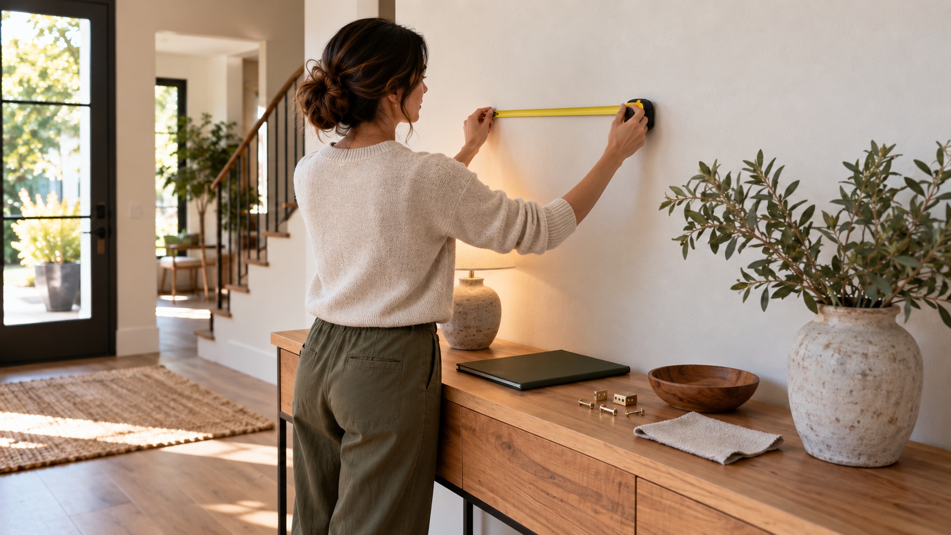
Measuring the available wall is necessary, but the usable composition often depends on more than its edges. Furniture, doors, lighting, neighboring artworks, and approaching sightlines all affect what looks balanced. Photograph the setting from the normal viewing position and place a simple proportional mockup over that image. Then check the proposal in the room with temporary paper shapes or another appropriate non-damaging method. A drawing that looks generous on a blank canvas may feel compressed above a crowded console. The goal is to make the work legible and proportionate within the real arrangement, including objects that will remain around it.
For larger pieces, review how the installation changes movement and maintenance. Freestanding elements need enough surrounding room for the activities taking place nearby, and a wall-mounted work should not create an unexpected obstruction. Ask a qualified installer or relevant site team to assess the proposed fixing and supporting surface. Public settings may also require project-specific approval from the responsible authority or property owner. Obtain that guidance for the actual location rather than relying on a general decorative idea. A good visual concept becomes more convincing when its practical footprint has been considered from the beginning.
Select Materials for the Conditions the Piece Will Face
Wood, metal, acrylic, painted panels, vinyl treatments, and other fabricated systems can all support word art, but the finished system matters more than a material name alone. Consider contact, moisture, sunlight, cleaning, expected lifespan, and the surface receiving the work. A sheltered home shelf and an exposed public installation are different environments even when the lettering looks similar. Ask the maker to explain the proposed finish, fixing method, maintenance, and any limitations for the intended use. Request a physical sample where color, sheen, or texture will influence the result. Compare that sample under the lighting of the actual location before approving the whole piece.
Budget for the Complete Installation and Its Future
A purchase price for the letters does not necessarily include the work needed to make them usable in the space. Design development, proofs, finishing, transport, access equipment, installation, and later maintenance may belong to separate parts of the project. Ask for an itemized scope that makes these responsibilities visible. Decide who supplies the final wording and who approves it, because a beautifully fabricated spelling error is still an expensive mistake. For a small home piece, the process can remain simple. For a larger commissioned work, clear responsibilities protect both the concept and the practical delivery.
Think about the expected life of the message as well as the expected life of the object. A business statement may change when its organization changes; a public text might need periodic review with the community responsible for it. Temporary events need a plan for removal, storage, reuse, or disposal. Permanent installations need accessible records of materials, finishes, fixing details, and care instructions. Discuss how a damaged letter or a changed word could be replaced without rebuilding everything. These questions help distinguish a piece that is merely impressive on arrival from one that continues to serve its setting over time.
The final approval should happen with the wording, layout, materials, and location considered together. Examine a proof containing every final character, check dimensions against the site, and confirm that the proposed installation method is agreed by the appropriate people. Keep the approved version in the project record. Avoid making an unreviewed wording change after the fabrication proof has been signed off, even if it seems small. One altered word can affect line breaks, balance, overall width, and the physical components required. A short final review is much easier than trying to correct the installation after delivery.
Judge the Transformation After People Use the Space
Once the work is in place, observe the relationship you originally intended to create. Does the home piece feel connected with the household? Can visitors recognize the workplace message without confusing it with directions? Do people in a public setting approach the work in a way that fits its purpose? These observations are more informative than counting compliments on installation day. A meaningful artwork does not have to produce the same reaction from everyone, but it should remain understandable within its intended context. Review placement, glare, surrounding clutter, and any practical issues after the space returns to ordinary use.
Word art transforms a setting through repeated encounters with language. The strongest ideas allow a phrase to gain significance from where it is found and who finds it, rather than asking the lettering alone to supply all the meaning. Choose words with a clear connection, give them a form appropriate to the encounter, and carry that idea through the details of fabrication and care. Leave room for the rest of the space to function. A considered installation can become a familiar point of identity, reflection, or welcome precisely because its message and its setting continue to make sense together.