Begin With the Interior's Unfinished Conversation
A modern interior may already have carefully chosen furniture, lighting, and finishes, yet still lack a clear point of identity. Word art can supply that missing connection when its message and placement respond to the room. The best installation idea is therefore not a style selected from a universal list. It is a considered answer to an interior question: what needs emphasis, which experience should feel more personal, and where could language contribute without making the space harder to use? From a discreet shelf object to a commissioned wall composition, the possibilities become more useful when they are linked with proportion, visual hierarchy, and the activities of the people who live or work there.
A: No. The room's actual composition, use, and identity matter more than a broad style label.
A: A quiet surface can balance stronger architectural features or neighboring objects.
A: Connect its wording with nearby objects and a meaningful personal association.
A: Its apparent scale and relationship with furniture may differ from the entrance view.
A: The recess's proportions, lighting, viewing distance, and the message's purpose.
A: Yes. A considered fragment can add a personal connection while keeping the composition coherent.
A: The name identifies the organization; the statement contributes another layer of meaning.
A: Lighting, reflections, and surrounding finishes can change their appearance.
A: Its suitability for the actual wall finish and product system.
A: Keep its purpose, care information, and approved design available for later decisions.
Treat the Room as a Composition Before Adding Words
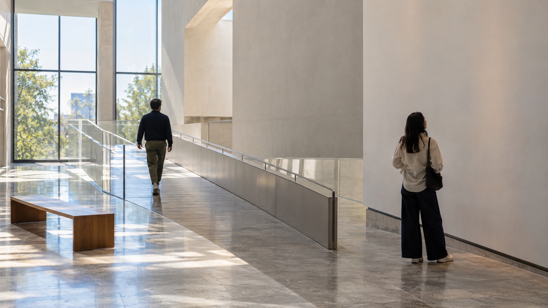
Look at the interior from its normal entrance rather than from the angle used for a promotional photograph. Identify the dominant shape, the brightest surface, and the area where attention naturally settles. A large window or a strong architectural detail may already provide the focal point. Adding a bold text installation beside it can create competition instead of clarity. Sketch the room’s existing hierarchy in a few simple shapes before introducing the phrase. Decide whether the words should become the main focus, support an existing feature, or offer a quieter discovery. That decision will influence nearly every other part of the proposal.
Modern interiors are not all minimal, neutral, or spacious. Some combine old and new furniture, others accommodate dense collections, and many must work within modest rooms. An installation should respond to those actual conditions. A narrow hallway may suit a compact line arranged along its journey, while a large shared lounge could hold a more substantial composition. Do not equate empty wall area with available attention. The room may need that quiet surface to balance neighboring objects. Compare a proposal with the room as a whole before deciding that every blank area requires a message.
Evaluate the wording and the visual mass together. A short name can occupy considerable space when its letters are deep and strongly shadowed. A longer passage can remain restrained when its treatment is light and the reading distance is close. Prepare several arrangements of the final text instead of experimenting only with substitute words. Line breaks, punctuation, repeated shapes, and the width of particular letters all affect the composition. An idea that depends on one elegantly short sample may not survive the actual message. The most useful sketch already acknowledges what the installation will say and where it will be seen.
Use a Quiet Statement Above an Everyday Gathering Place
A wall above a dining bench, a low console, or a shared seating area can hold a concise line that becomes familiar through ordinary use. This direction works when the text has a relationship with the gathering rather than simply announcing a fashionable sentiment. Consider an original phrase agreed by the household or a short reference to a meaningful place. Keep the treatment proportional to the furniture group and examine it from seated positions as well as while standing. A line that looks balanced from the doorway may loom over someone sitting directly beneath it. Test the placement with a temporary size study before commissioning the final form.
Create a Shelf Installation That Changes With the Room
Freestanding word art on a shelf offers a more flexible approach than a permanent wall treatment. A single word, a name, or a compact group can sit among objects with related meaning. Its usefulness comes from that relationship: a place name beside travel photographs or an original title alongside a small personal collection. Keep enough open space around the piece to distinguish its silhouette from neighboring objects. A dense shelf can make dimensional letters look fragmented or unreadable. Test the arrangement from the distance at which the shelf is normally noticed, not only while standing directly in front of it.
A movable piece also needs a practical position. It should remain stable, avoid obstructing everyday access, and suit the support on which it rests. Ask the maker about the intended placement and any limitations, especially where children, pets, or regular handling are part of the room’s use. Consider the piece’s full depth rather than its frontal width alone. A narrow shelf may accommodate the word visually but provide inadequate support for its base. Keep the option to reposition the installation as surrounding objects change. Flexibility is valuable when it is designed into the physical format as well as the visual idea.
Give an Architectural Recess a Purposeful Language Accent
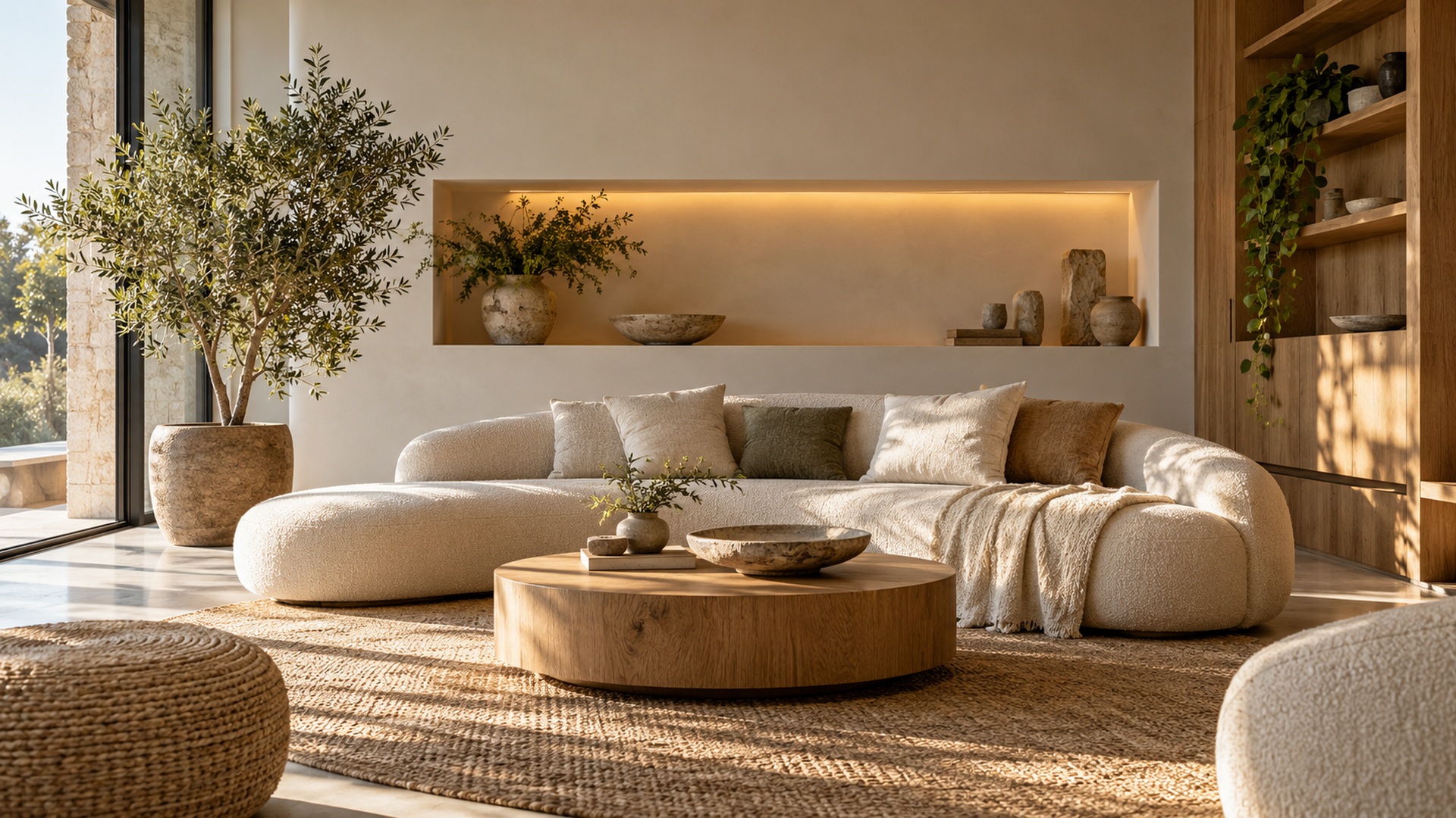
An existing niche, shallow recess, or defined wall panel can create a natural frame for a text installation. Let its proportions guide the arrangement without forcing the phrase to fill every edge. A carefully selected line can draw attention to the architectural feature while retaining breathing room around the lettering. Check the lighting inside the recess, because a strong shadow may change the apparent weight of dimensional forms. If new illumination is proposed, involve the appropriate design and installation team rather than treating it as a decorative afterthought. The text, surface, and light should be reviewed together in a realistic sample or mockup.
Bring Personal Handwriting Into a Contemporary Setting
A restrained contemporary room can accommodate handwriting with a personal history. A selected dedication or an original line may introduce a human trace among more regular architectural forms. The contrast should remain purposeful. Choose a passage whose meaning belongs in the room and whose source can be used appropriately. Preserve the recognizable character of the writing while reviewing how it will reproduce at the proposed scale. A delicate connection on paper might disappear in a fabricated piece or merge when viewed from a distance. Work from a clear approved source and ask for a proof showing the entire final line.
Handwriting does not need to cover a large wall to carry significance. A small panel beside a reading chair, a modest shelf object, or a discreet line near a family photograph can give it a coherent setting. Avoid surrounding it with unrelated decorative quotes that weaken the personal connection. Compare the proposed treatment with the other textures in the room: natural wood, smooth plaster, fabric, and metal can all change how the writing is perceived. The material choice should also suit the location and care required. A meaningful source deserves the same practical attention as a more overtly sculptural commission.
Discuss privacy before turning personal writing into a visible installation. A household may welcome a familiar sign-off but prefer to keep the rest of a letter private. Someone’s name or dedication may also need an agreed context when the space is shared with guests or clients. These choices should happen before the visual proof is finalized. The installation’s emotional connection depends partly on consent and understanding, not simply on how faithfully the strokes are reproduced. A smaller agreed fragment can be more appropriate than a longer passage whose visibility creates discomfort. Keep the final wording and source approval together in the project record.
Separate Reception Identity From Interior Decoration
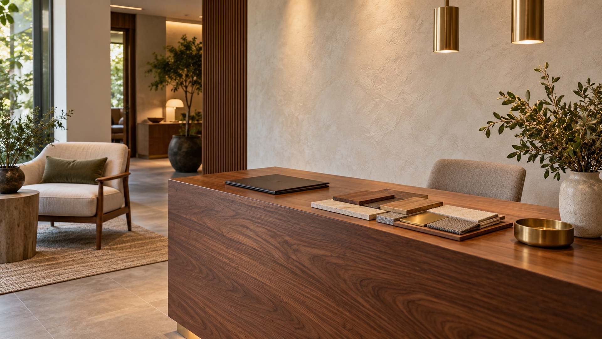
In an office or hospitality interior, a word installation can identify the organization or express a message connected with its service. A reception name and a reflective wall phrase perform different jobs, even when both use attractive lettering. Give each a clear role in the overall composition. Visitors should recognize the organization promptly without mistaking a decorative statement for its official name. Check the installation from the entrance and from the point where staff greet people. A large background phrase can overwhelm the interaction if the room was designed around a quieter welcome. Use hierarchy to establish the order in which the elements should be understood.
Supporting details matter in this setting. The name must use the approved spelling and brand artwork where applicable, while any additional line should be reviewed for accuracy and relevance. Avoid promising a service quality the everyday operation cannot support. Consider how the work will appear behind people in photographs or video calls, but do not let that viewpoint override the needs of visitors physically using the room. Examine reflections, shadows, and adjacent practical signs under ordinary conditions. The installation becomes part of the reception system, so its success depends on communication and use as well as the interior’s visual style.
Use Color and Contrast to Connect Rather Than Compete
A text installation can relate to an existing interior through a selected material, a repeated color, or a complementary surface treatment. It does not have to match every finish exactly. Begin with a physical sample placed in the room and compare it under the lighting that people normally use. A glossy material can look darker or brighter than expected because of reflections, while a pale treatment can lose definition against a similarly pale wall. Check readability at the actual distance and angle. Choose the relationship that supports the intended emphasis rather than assuming that matching a palette automatically creates a successful composition.
Plan Around the Room's Ordinary Constraints
Doors, switches, ventilation openings, storage access, and movable furniture are part of the setting the installation must share. Record them in the site study instead of excluding them from the rendering. A piece placed over a cupboard might look excellent until the door opens; lettering near a frequently handled surface may face different cleaning and contact than expected. Discuss these conditions with the maker and installer. Ask how the supporting surface, fixing method, and finish relate to the actual use. A proposal that acknowledges ordinary constraints is more likely to remain convincing after the room returns to daily activity.
Budget for proofing and practical delivery along with the visible object. Confirm who measures the site, who approves the final wording, and who is responsible for installation. Request the care information needed by the person who will maintain the interior. If the room is rented, shared, or likely to be rearranged, discuss an appropriately reversible format with the responsible parties. Avoid assuming that a removable-looking material will behave safely on every finish. The suitability of a method depends on the actual surface and product system. Resolve those details before ordering so the decorative idea does not become a repair problem.
Choose the Idea That Improves the Whole Interior
Compare the shortlisted ideas with the same room views and final wording. One may create a clearer focal point; another may offer a more personal connection without changing the room’s balance. Judge each against the original purpose rather than choosing the largest or most unusual option. Ask people who use the interior how the proposal affects their experience of it. Their observations can reveal whether the text feels welcoming, distracting, overly formal, or disconnected. Keep the response tied to visible details and actual use, because a general preference for one style does not explain whether it serves this particular room.
After installation, review the piece in ordinary light and with the usual furniture and objects present. Make sure its intended relationship still reads clearly when the room is being used. Small changes around the work can sometimes restore balance without altering the installation itself: reducing nearby clutter or reconsidering a competing decorative object may be enough. For any change to the physical piece or its placement, consult the appropriate project team. Keep the approved design and care records accessible. A successful interior idea is supported by a practical system that lets it remain useful as the setting evolves.
The best word art installation for a modern interior is one whose language, form, and location make sense together. It might be a quiet line above a shared bench, a personal handwritten fragment, a flexible shelf object, or a carefully composed reception identity. These directions are valuable because they address different interior needs. Choose the relationship the room actually lacks, then develop the installation through scale studies, accurate wording, material samples, and realistic use checks. The finished work should make the interior feel more coherent and more connected with its people, while leaving space for the rest of their lives to continue around it.