A Map for Exploring the World's Written Forms
World lettering is too broad to fit into a neat set of national looks. Writing travels, tools change, languages share scripts, and individual makers reshape inherited practices. A useful guide therefore begins with relationships rather than a catalogue of stereotypes. It asks how a script works, how a form is made, what the words are doing, and how the finished object reaches its readers. This overview gives curious readers and designers a framework for exploring that variety. It cannot inventory every living tradition, but it can help you organize what you encounter, find trustworthy examples, and recognize when a project needs knowledge beyond an attractive visual reference.
A: No. A useful overview provides reliable ways to explore a field larger than any short catalogue.
A: They separate the writing system, making process, textual role, and circumstances of a particular object.
A: Technique, surface, script conventions, and individual decisions also shape the result.
A: It interprets selected forms within a repeatable system rather than recreating every act of writing.
A: Place can provide context, but migration and shared practices complicate a simple national classification.
A: Not automatically. Different structures may need different treatments to achieve comparable prominence.
A: They reveal practical uses and everyday decisions beyond museum masterpieces.
A: Sources, specific questions, context, and clear uncertainty make comparisons reviewable.
A: When a real project requires correct unfamiliar wording or mastery of a particular practice.
A: Update the description and retain enough source history to explain the improved understanding.
Use Four Questions to Orient an Encounter
When you meet unfamiliar lettering, begin by asking what system is being used, how the forms were made, what purpose the text serves, and where the object belongs. These questions concern script, method, function, and context. They do not always have immediate answers. A photograph may show enough to describe a brush-made line while leaving the language unresolved. A catalogue may identify the language but not the maker. Keep each answer separate until evidence connects them. This simple framework allows partial knowledge without turning it into an unsupported complete story.
A world guide becomes more useful when it accepts overlap. One script can represent several languages, and one language can appear in different scripts or writing conventions. A calligrapher can practice in a place far from a tradition’s historical center. A printed design can imitate writing made by hand. None of these possibilities makes identification impossible; they make broad country labels insufficient. Look for the particular combination present in the object. The combination, rather than a single visual cue, supplies the beginning of a meaningful account.
Make the framework practical by recording your sources. A museum object page, a library catalogue, a maker’s explanation, and a reliable language reference answer different questions. Save the relevant information alongside the image. Distinguish what the source explicitly states from what you infer through appearance. If two descriptions disagree, examine whether they refer to different levels, such as a script name and a stylistic treatment. A careful record prevents a tentative impression from becoming a repeated fact merely because it has been copied into several project folders.
Understand What a Script Organizes
A script is a system for representing language in visible signs, not simply an ornamental style. Different writing systems organize their signs in different ways, and their presentation conventions matter to design. Some forms connect, some combine into larger units, and some depend on marks that a novice might mistake for decoration. Direction and line arrangement also require attention. For a project using actual words, learn the relevant structure through competent language and script expertise. Rearranging unfamiliar signs to match a preferred silhouette can damage communication before any stylistic question is addressed.
Recognize That a Style Exists Within a Practice
A named hand or style concerns particular conventions for making and arranging forms. It may be associated with a tool, a period, a textual function, or a teaching lineage. It can also contain considerable individual variation. The name is a starting point for comparing examples, not a guarantee that every specimen looks alike. Look at more than one work and use descriptions that identify the actual maker and object. This prevents the most frequently reproduced example from becoming the only version of a tradition you recognize.
Consider the role of training. A controlled written form can reflect repeated practice that is difficult to reconstruct from its outline. A designer may see the finished shape without seeing the sequence that produces it. Demonstrations and guided exercises can explain relationships that still images conceal. At the same time, drawn lettering can deliberately depart from a writing method to solve a unique composition. Ask which practice produced the reference before assuming that its forms can be transferred through the same process to a new assignment.
Tools and Surfaces Shape the Visible Result
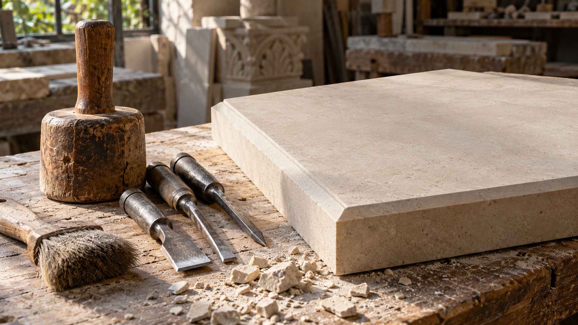
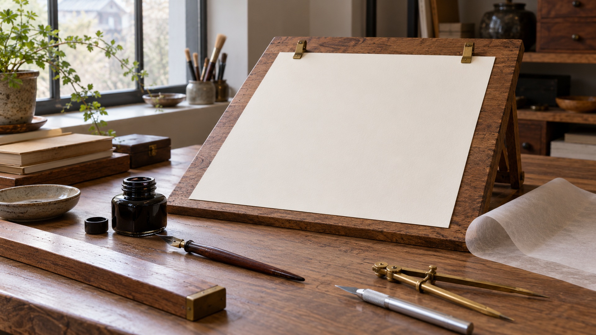
Pens, brushes, carving tools, and other implements offer different possibilities, but the tool alone does not determine a complete style. A maker’s technique and the surface also contribute. Paper can absorb ink differently from a prepared board; stone can catch light differently from a printed outline. Look at the interaction rather than assigning every feature to one cause. A rough edge might reflect material behavior, a deliberate choice, damage, or the reproduction. Specific documentation helps separate those possibilities, especially when the image is small or incomplete.
This distinction matters when a design changes medium. A hand-written model translated into a digital font becomes a system of repeatable forms. A drawing turned into a three-dimensional sign must accommodate thickness, joins, mounting, and viewing conditions. A historical page reproduced on a screen loses some physical information while gaining opportunities for enlargement. Each transformation can be useful, but it changes the encounter. Evaluate what must be preserved for the present task instead of claiming that a new medium carries every property of the original.
For hands-on study, choose a manageable question about material behavior. Compare how a suitable pen moves on two papers, or inspect how side light reveals a carved edge. Keep the exercise modest and clearly described. It should improve observation without encouraging an untrained reconstruction of a culturally significant work. Where a tradition depends on specific knowledge, learn from a practitioner. Tools become a route into understanding when their use is connected to technique and meaning, rather than collected as decorative symbols of craftsmanship.
Explore Chinese Calligraphy Through Documented Variety
Chinese calligraphy is a useful example of why a broad practice requires internal distinctions. The Smithsonian’s Writing, Carving, and Rubbing exhibition traces several script types and the relationship among writing and reproduction methods. Use such documentation to find individual works and compare their structure. Look at the entire composition, the material, and the recorded circumstances of making. Avoid treating one brush texture as an adequate account of the field. A world overview should open routes into detailed study, not replace those routes with a decorative shorthand.
Explore Arabic-Script Traditions Through Text and Context
Arabic-script calligraphy appears in several languages, settings, and named styles. The Library of Congress’s introduction to its calligraphy sheets provides an entry into that variety through identifiable objects. Follow the language, style, attribution, and purpose of the specific example. A page may carry devotional wording, poetry, or a demonstration of skill. Those roles matter to how the text is arranged and how a contemporary viewer should understand it. Connected forms alone do not explain the work.
For a commission, involve language expertise before finalizing the layout. Correct wording and appropriate context cannot be repaired by an attractive outline alone. A practitioner can advise on forms, relationships, and suitable treatment, while a competent reader can review the actual text. These responsibilities may overlap but should be made explicit. A general guide can help a designer know what to ask; it should not create the impression that familiarity with a few labels is enough to produce a correct and meaningful result independently.
Latin Lettering Includes Many Different Histories
Latin letters appear in manuscript hands, inscriptions, printed type, commercial signs, personal handwriting, and contemporary drawing. These uses involve different conventions and purposes. A formal uppercase inscription, an italic hand, and a lively brush-painted title should not be treated as one cultural look. Follow a specific reference to its source and production method. The V&A’s account of Morris and the printed book shows one example of a designer studying earlier printed work while developing a new project. That is a particular history, not a summary of all Latin lettering.
A designer can use this variety to ask better practical questions. Does the project need sustained reading, a distinctive short title, or clear distant recognition? Is the reference handwritten, drawn, carved, or typeset? Are its proportions connected to the original wording? The answers affect how much of the source should inform the new work. Avoid assuming that a historical appearance is automatically more suitable for craftsmanship or that a contemporary one is automatically easier to read. Test the actual text, audience, and medium instead.
Also distinguish handwriting from lettering made to resemble handwriting. A personal letter can preserve habits formed through everyday use. A carefully drawn commercial title may simulate spontaneity through repeated revision. Both can be effective, but they tell different stories about making. Describe the result accurately when presenting it. A world perspective becomes more useful when it attends to these ordinary differences, rather than restricting attention to celebrated calligraphic works and overlooking the writing people encounter in daily life.
Regional Traditions Cannot Be Reduced to a Travel Map
Geography matters, but it is not a complete classification system. Trade, migration, education, religion, printing, and individual careers carry writing practices across borders. A national label may conceal several scripts and communities, while a regional style may be practiced internationally. Ask how the specific object reached its setting and which evidence supports its attribution. Do not interpret every shared feature as borrowing or every difference as isolation. A catalogue or specialist account can explain a relationship more reliably than a visual resemblance paired with a map.
Plan Multilingual Work Around Actual Readers
A multilingual design brings writing systems into one shared setting, but they do not need to look mechanically identical. Equivalent prominence may require different sizes or arrangements. Forms with different internal structures can feel cramped if forced into one height rule. Ask skilled readers to evaluate their own language’s presentation and consider the entire message together. The goal is a coherent experience that respects each text, rather than a visual match achieved by weakening one script’s readability.
Review the wording and display in context. A heading, a directional instruction, and a ceremonial phrase ask for different treatment. Check line breaks, order, punctuation, and the relationship between translations. Make responsibilities clear so that one language is not reviewed carefully while another is accepted because it looks attractive. Include actual-size proofs and realistic viewing conditions where relevant. These steps connect the broad study of world lettering with the concrete needs of people who will use the finished design.
Build an Expanding Reference System
Organize references around questions you want to understand rather than a folder of exotic appearances. You might group works by tool behavior, page hierarchy, public display, or named tradition while retaining their individual information. Add makers’ explanations, collection records, and language guidance where available. Include ordinary lettering and current practice alongside historical objects. This organization encourages comparisons that have a clear purpose. It also makes gaps visible, so you can seek information instead of repeatedly drawing from the same small set of familiar images.
Use the Overview as a Beginning for Further Study
A complete working guide is one that helps you continue learning, not one that claims to exhaust every tradition. Return to the four questions of script, method, function, and context whenever a new example appears. Follow documented works into narrower studies, learn from practitioners, and keep uncertainty visible. If a project depends on unfamiliar wording or a specific practice, bring in the necessary expertise. The world’s lettering becomes easier to explore when variety is treated as something to understand through particular people and objects, with each informed encounter expanding the next.
Over time, revisit your earlier descriptions and revise them when better evidence becomes available. A term learned from a collection record may replace a vague label; a translation may change how you understand emphasis; a demonstration may explain a feature once attributed only to decoration. Those revisions are signs of useful learning. Keep the old source trail where it helps explain the change. A reliable reference system remains open to correction, and a curious designer benefits from that openness as much as from any newly recognized style.