Depth changes more than the letter face
A three-dimensional word changes a space partly through what it says and partly through what it does to the room. Its bodies project from a surface, create shadows, interrupt an empty wall, and draw people toward a particular view. A visitor can experience the work as a message from the front and as a series of volumes from the side. That makes dimensional lettering a useful spatial design tool, but transformation does not require covering the biggest wall with the largest possible word. A carefully placed installation can establish a focal point, soften a transition, frame a gathering area, or reveal a relationship with the architecture. The strongest ideas begin with the room’s existing character and the experience that needs to change. From there, language, scale, spacing, depth, light, and surrounding emptiness can work together as one composition rather than as decoration added after the space is finished.
A: A carefully placed focal point can alter the room's hierarchy without occupying most of its surface.
A: It can add depth while keeping a narrow or visually quiet interior less intrusive.
A: Yes. They may dominate oblique approaches and influence the object's character.
A: It can be an expressive choice, provided it does not undermine an essential identification task.
A: It affects emphasis, rhythm, and how comfortably the composition relates to its architecture.
A: Its changing direction can alter shadows, reflection, and the apparent letter outline.
A: Choose an effect and intensity that belong to the surrounding atmosphere rather than dominating it.
A: It also needs workable positions for people and cameras without obstructing normal movement.
A: Decide how the message, components, or placement can adapt while retaining a coherent design.
A: Observe the whole room, the approach experience, and ordinary audience use—not only the object face.
Identify the spatial change you actually want
Describe the room before describing the sign. Is it difficult to recognize, visually unfocused, overly formal, or lacking a place where visitors naturally gather? Different problems call for different interventions. A clear dimensional name might establish identity, while an expressive phrase could encourage a slower encounter. A large freestanding word might organize a photo area, whereas a shallow wall installation could add character without occupying floor space. The idea becomes more precise when it responds to a specific condition instead of promising that any dimensional object will automatically transform any room.
Look at what is already working. Existing views, materials, lighting, and movement patterns can provide a foundation for the lettering. A strong architectural axis may suggest an aligned focal point; a quiet alcove may invite a more intimate message. Avoid adding visual competition simply because an empty surface is available. The installation should make the room’s intended experience more coherent. That can mean emphasizing an existing relationship rather than introducing a completely different style that asks the architecture to accommodate an unrelated object.
A practical project statement can keep this intention clear. Describe the before-and-after experience in terms of the visitor, such as recognizing the entrance earlier or finding a comfortable place to pause. Then evaluate concepts against that statement. A striking rendering may still fail to create the desired change if its position disrupts circulation or if its words do not fit the setting. The spatial purpose gives the team a useful standard for deciding which features contribute and which are merely attractive additions.
Use a single word as a visual anchor
A short word can establish a point around which the room’s other elements become easier to understand. It might sit behind a reception desk, at the end of a corridor, or within a gathering space. Select its size and position in relation to the whole composition, including furniture and the approach route. The anchor should be visible at the moment it helps orient the viewer, not only from an ideal centered photograph. Give the word enough surrounding space to feel deliberate, and resist filling that space with secondary slogans that weaken the focus it was meant to create.
Let shallow depth create a quieter intervention
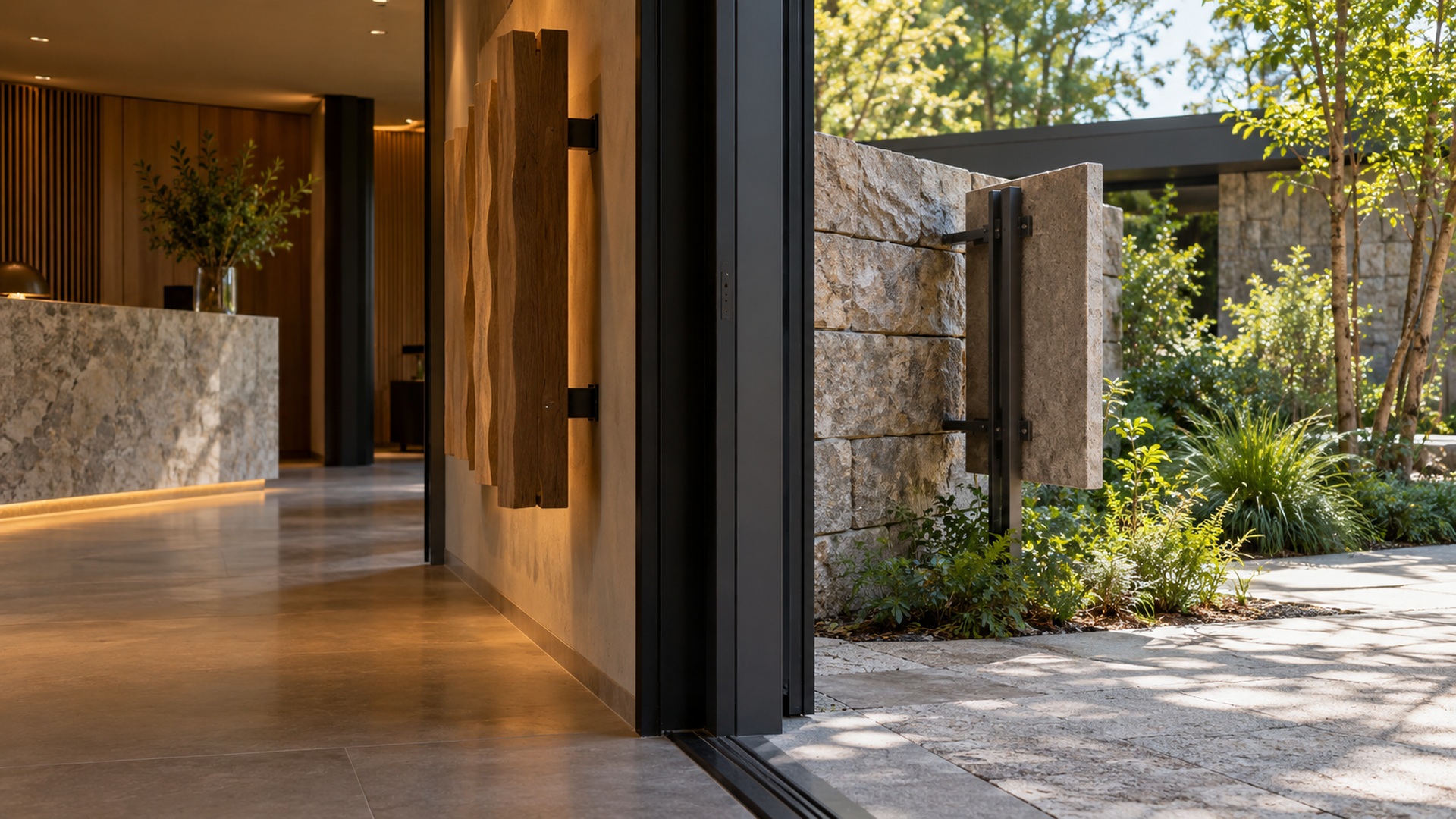
A modest projection can change a flat wall without giving the room an imposing object. Side surfaces and a controlled shadow gap can provide definition while keeping the installation close to the architecture. This approach can suit spaces where circulation is tight or where the message should support rather than dominate the interior. Review the actual wall texture, because a shadow that looks crisp on a smooth studio background can behave differently against masonry, timber, or a patterned finish.
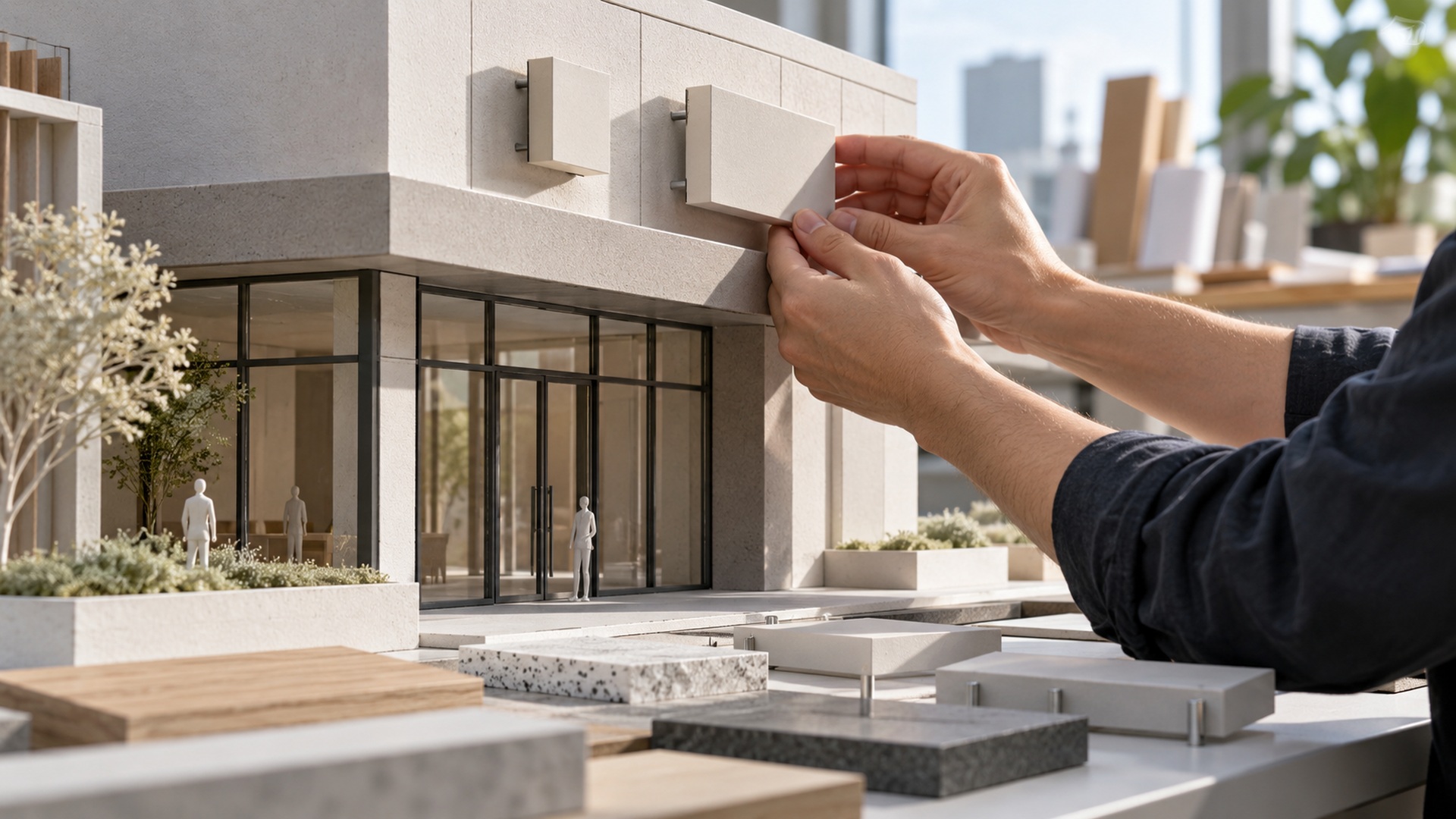
The subtle effect depends on spacing and lighting. Characters placed too closely can merge through their shadows, while a large gap between wall and letter may reveal supports that were expected to remain discreet. Test a representative detail in context and examine it from several directions. The aim is not to maximize depth but to give the forms a convincing presence. A restrained installation can feel carefully integrated when its visible edges, mounting, and shadows all belong to the same visual relationship.
Consider deeper letters as objects in the room
As depth increases, a word begins to behave more like a group of objects than a surface treatment. The side view can become as prominent as the front, especially along a corridor or beside an entrance. Decide whether that sculptural presence supports the room’s purpose. A deep letter may create an inviting landmark in a generous lobby but feel intrusive in a narrow passage. Include the projecting volume in the space plan rather than evaluating only the face dimensions on an elevation drawing.
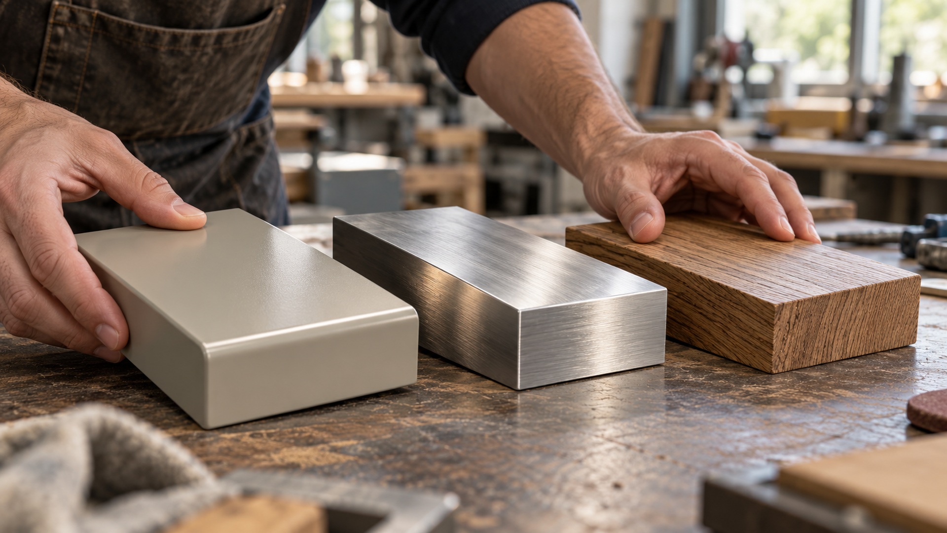
Side finishes deserve deliberate treatment. A contrasting return can emphasize the physical body; a matching surface can make the letter appear more unified; a reflective side can introduce changing highlights. Choose the effect by considering how people move past the installation. The work should remain convincing beyond the one view that shows its complete wording. A visitor’s changing angle can become part of the experience when the construction details are designed to reward it rather than treated as backstage surfaces no one will notice.
Deep forms can also hide one another at oblique angles. A word that reads clearly from the front may become visually compressed from the main approach. Adjust spacing, depth, or position after testing that view. If the installation is mainly expressive art, partial reading might be intentional; if it identifies a destination, the ambiguity may be a problem. The distinction should be made explicitly. Otherwise, a dramatic spatial effect can quietly undermine the communication role that justified the word’s placement.
Make negative space part of the lettering idea
The empty areas around and within the word contribute to the room’s character. A generous margin can make a short phrase feel calm and focused, while a dense composition can produce a more energetic encounter. Small interior openings may become less apparent once the letter bodies and shadows are added. Review those spaces as actual shapes rather than leftovers between solid forms. The room also supplies a larger field of emptiness around the installation, and that relationship can be as important as the lettering itself.
A simple on-site mockup can reveal whether the composition breathes. Mark the proposed extents and stand at the expected viewing positions without filling every unused area with another element. Compare the word against architectural joints, windows, furniture, and adjacent artwork. If the room feels crowded, reconsider the proportion or remove competing information before increasing visual complexity. A dimensional installation can transform a space through selective emphasis, with carefully preserved emptiness making the chosen message more noticeable and the surrounding experience more comfortable.
Treat shadows as a changing layer of the design
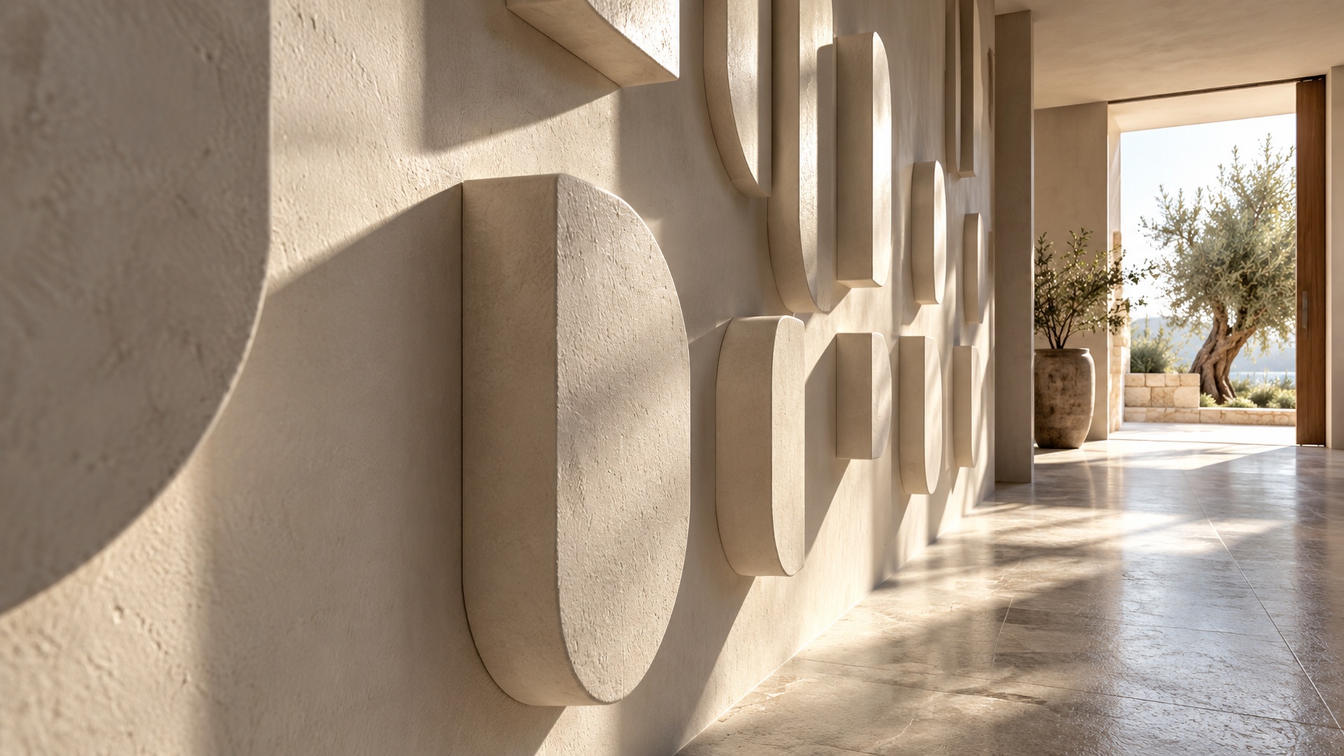
Shadows reveal depth, but their direction and strength change with the light. A wall installation beside a window may create a different composition in the morning and late afternoon. Artificial lighting can add several shadow edges instead of one clean outline. Observe the room at relevant times and test the proposed projection with a physical sample. Decide which effects are welcome and which interfere with reading. The idea should account for the ordinary lighting conditions rather than depend on a single carefully staged moment that will rarely occur after installation.
Use illumination to connect the word with atmosphere
Integrated or external light can make lettering feel connected to the room’s atmosphere. A soft separation from the wall can establish a quiet focal point, while a glowing face can make the word more prominent. Select the effect based on the experience you want, including the relationship to other fixtures. A display intended to support a relaxed gathering area may lose that purpose if it becomes the brightest object in every view. Review both the word and the surrounding room when assessing a lighting sample.
Daytime appearance still matters. Transparent or translucent components, cables, service openings, and unlit faces remain visible when the illumination is off. Check those conditions before approving the night effect. Plan operation and maintenance at the same time, including control, power routing, and access to replaceable parts. A lighting concept is successful when it works as an ordinary part of the space, not only as a dramatic opening-night image. Its practical routine should support the atmosphere rather than create repeated interruptions around a difficult-to-service feature.
For photography, compare the brightness of the word with the people and architecture around it. Strong illumination can produce a glowing shape without preserving the intended detail in a phone image. The useful adjustment may involve a different effect, light placement, or surrounding illumination rather than simply increasing output. Test representative views that visitors are likely to use. The room’s transformed character should remain recognizable across those ordinary encounters, including photographs taken without a specialist adjusting the scene.
Shape a gathering area without creating an obstacle
Freestanding lettering can give people a place to gather and a reason to pause. Plan the space beside and around the word, including the camera position if photographs are expected. Think about how individuals and groups will share the area and how others will pass through it. The physical installation should not make participation depend on blocking a doorway or occupying a busy route. Mark the full footprint, including the support, before deciding that the composition fits comfortably within the room.
Public interaction needs an agreed construction brief. Looking, touching, leaning, and sitting are different intended uses, and a sculptural appearance does not establish suitability for all of them. Explain the expected behavior to the fabricator and installer so the assembly can be developed for the actual setting. Review visible edges and supports as part of the experience as well as the structure. A gathering feature should feel welcoming because its proportions and surrounding space support the audience, not because visitors must improvise around an object designed only for a photograph.
Make the transformation adaptable where change is expected
Spaces evolve, and the lettering should be considered within that life. A retail interior may change displays often; an event venue may host different audiences; a workplace may rearrange furniture or rename teams. Decide whether the installation expresses permanent identity or a changeable message. Removable, modular, or replaceable elements can support adaptation when planned from the start. Keep the approved drawings and finish references so later changes retain the relationship that made the original composition work, rather than becoming a sequence of mismatched additions attached wherever space happens to remain.
Evaluate the room after the object is installed
Stand in the main approach, sit where visitors wait, and walk past the installation from both directions. Notice what the word now makes prominent and what it obscures. Check whether its shadows, reflections, and projection create the intended character under real operating light. Compare the result with the spatial purpose established at the start. The final review should include the room around the word, because a technically excellent letter assembly can still need a placement adjustment to create the intended experience.
Listen to how people describe the space after using it. They may recognize a clearer identity, find a natural photo position, or notice a new focal point without naming every design feature that contributes. They may also reveal an unintended obstruction or an uncomfortable brightness level. Use those observations to refine the installation where possible and to guide later commissions. The strongest transformation is not necessarily the most elaborate object. It is a considered relationship among language, volume, light, and the everyday life of the room.